Hello, learner today In this blog post, We will be creating a Glassmorphism loader Animation using HTML and CSS. In the past post, we have created many projects one of them is the Login Form. Without wasting time Now it is time to Glassmorphism Loader.
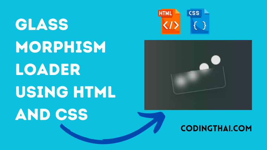
In this article, We will be creating an animated loader using glass morphism. Glassmorphism Loader is a user interface design trend. Glassmorphism is a design that involves creating user interface (UI) elements with a transparent or semi-transparent glass-like appearance.
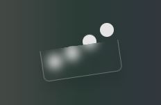
Let’s have a quick look at the given image of the project that we are going to create [Glassmorphism loader Animation]. In the image, we can see a total of four dots behind the Glass. Every dot goes up and down behind the glass. The glass also moves up and down side by side.
At first, we have to create a div container inside the container Create four more div for dots. The four div make loading animation. that’s all in the HTML section
In the CSS section, we style and Animate the Glassmorphism loader using different CSS styling properties.
| Code By | Coding thai |
| Language Used | HTML And CSS |
| Responsive | Yes |
| External Link / Dependencies | Yes |
There are 3 types of styles to connect CSS with HTML files. Inline CSS, Internal CSS, External CSS. For Inline CSS in this, we have to write the CSS code inside the HTML code using style Attribute elements. For internal CSS we have to use the Style tag in the Head section on HTML File. We have used this Internal CSS in The below section. Last is External CSS for this we have to create another CSS File in the same folder this
Preview of Glassmorphism loader Animation
In this preview, we have used internal CSS in the code. In the internal CSS, we have to write the code in the head section using the Style tag. We have to write the code in <Style> CSS code </style> in the Head section in the HTML file. This code is run in Codepen.io
See the Pen Glassmorphism loader Coding thai by Coding thai (@Codingthai) on CodePen.
You might like this
- Sneakers Product Card using HTML and CSS
- Snake Login Form using HTML, CSS, and JS
- Dynamic Stopwatch using HTML5, CSS3 and JS
- Square Navigation Bar using HTML5 and CSS3
- Liquid Loading Effect Using HTML5 And CSS
Glassmorphism Loader using HTML and CSS [Source code]
For Creating A Glassmorphism Loader Animation using HTML and CSS. First, you have to create two files (HTML and CSS) files with the named index.html and style.css in the same folder and you have to link the CSS files to HTML. after that paste the below code, the HTML code in index.html, and paste the CSS code in style.css that’s all after pasting the code.
First, you have to create an HTML file with the named index.html paste the below HTML code on it, and save it. Remember to give a .html extension to the HTML file.
<!DOCTYPE html>
<html lang="en" >
<head>
  <meta charset="UTF-8">
  <title>CodePen - Glassmorphism loader</title>
  <link rel="stylesheet" href="./style.css">

</head>
<body>
<!-- partial:index.partial.html -->
<div class="loader">
      <div style="--i: 1"></div>
      <div style="--i: 2"></div>
      <div style="--i: 3"></div>
      <div style="--i: 4"></div>
    </div>
<!-- partial -->

</body>
</html>
After pasting the HTML code, Now have to create a second CSS file with the named style.css. Paste the below code on it and save it. Again remember to give a .css extension to the CSS file.
* {
  margin: 0;
  padding: 0;
  box-sizing: border-box;
}

body {
  background: linear-gradient(to right, #917173, #2a3b36, #432c52);
  height: 100vh;
  display: flex;
  justify-content: center;
  align-items: center;
}

.loader {
  position: relative;
  display: flex;
  justify-content: center;
  align-items: center;
}

.loader::before {
  content: "";
  background: rgba(255, 255, 255, 0);
  backdrop-filter: blur(8px);
  position: absolute;
  width: 140px;
  height: 55px;
  z-index: 20;
  border-radius: 0 0 10px 10px;
  border: 1px solid rgba(255, 255, 255, 0.274);
  border-top: none;
  box-shadow: 0 15px 20px rgba(0, 0, 0, 0.082);
  animation: anim2 2s infinite;
}

.loader div {
  background: rgb(228, 228, 228);
  border-radius: 50%;
  width: 25px;
  height: 25px;
  z-index: -1;
  animation: anim 2s infinite linear;
  animation-delay: calc(-0.3s * var(--i));
  transform: translateY(5px);
  margin: 0.2em;
}

@keyframes anim {
  0%,
  100% {
    transform: translateY(5px);
  }
  50% {
    transform: translateY(-65px);
  }
}

@keyframes anim2 {
  0%,
  100% {
    transform: rotate(-10deg);
  }
  50% {
    transform: rotate(10deg);
  }
}
That’s all after pasting the code your code will be successfully run. If you get any kind of error/problem in the code just comment or contact me on social media
Output Result
Conclusion
After creating this Glassmorphism Loader Animation you will able to know how to create a Loading Animation easily. From this project, you will learn about different properties of CSS for Animation.
| Written By | @narendra-chand |
| Code By | Coding thai |