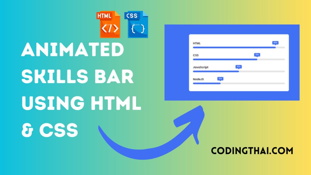
Hello, learner today In this blog post, We will be creating an Animated Skills Bar using HTML and CSS. In the past post, we have created many projects one of them is the Login Form. Without wasting time Now it is time to Animated Skills Bar.
A skills Bar is a combination of different skills, it is like the qualification of the particular person for the particular work. For example, if someone is a front-end developer, then he has knowledge of HTML, CSS, and JavaScript.
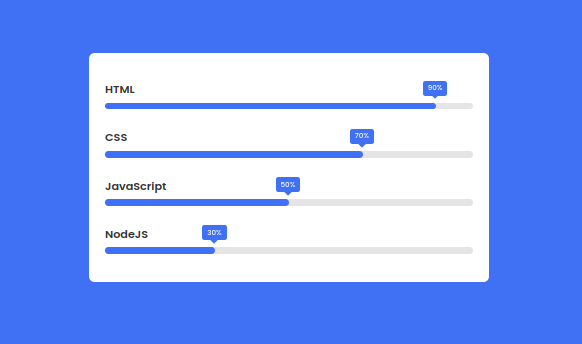
Let’s have a quick look at the given image of the project that we are going to create [Animated Skills Bar in HTML & CSS]. In the image, we can see a total of four bars. Every bar has a different title and percentage. When the page will refresh or open that percentage of skill gets animated.
At first, we have to create four skill div containers inside each container we have to use a span tag for Text. Again inside the skill div Create another div for the skill bar and percentage. do this again in the CSS Section, Javascript Section, and Node JS Section That’s all in the HTML section.
In the CSS section, we style the Animated Skills Bar using different CSS styling properties.
| Code By | Coding thai |
| Language Used | HTML And CSS |
| Responsive | Yes |
| External Link / Dependencies | Yes |
There are 3 types of styles to connect CSS with HTML files. Inline CSS, Internal CSS, External CSS. For Inline CSS in this, we have to write the CSS code inside the HTML code using style Attribute elements. For internal CSS we have to use the Style tag in the Head section on HTML File. We have used this Internal CSS in The below section. Last is External CSS for this we have to create another CSS File in the same folder this
Preview of Animated Skills Bar
In this preview, we have used internal CSS in the code. In the internal CSS, we have to write the code in the head section using the Style tag. We have to write the code in <Style> CSS code </style> in the Head section in the HTML file. This code is run in Codepen.io
See the Pen Animated Skills Bar Coding thai by Coding thai (@Codingthai) on CodePen.
You might like this
- Sneakers Product Card using HTML and CSS
- Snake Login Form using HTML, CSS, and JS
- Dynamic Stopwatch using HTML5, CSS3 and JS
- Square Navigation Bar using HTML5 and CSS3
- Liquid Loading Effect Using HTML5 And CSS
Animated Skills Bar using HTML and CSS [Source code]
For Creating An Animated Skills Bar using HTML and CSS. First, you have to create two files (HTML and CSS) files with the named index.html and style.css in the same folder and you have to link the CSS files to HTML. after that paste the below code, the HTML code in index.html, and paste the CSS code in style.css that’s all after pasting the code.
First, you have to create an HTML file with the named index.html paste the below HTML code on it, and save it. Remember to give a .html extension to the HTML file.
<!doctype html>
<html lang="en">
<head>
    <meta charset="UTF-8">
    <meta http-equiv="X-UA-Compatible" content="IE=edge">
    <meta name="viewport" content="width=device-width, initial-scale=1.0">

    <!--======== CSS ======== -->
    <link rel="stylesheet" href="style.css">

    <title>Animated Skills Bar</title>
</head>
<body>
    <div class="container">
        <div class="skill-box">
            <span class="title">HTML</span>

            <div class="skill-bar">
                <span class="skill-per html">
                    <span class="tooltip">90%</span>
                </span>
            </div>
        </div>

        <div class="skill-box">
            <span class="title">CSS</span>

            <div class="skill-bar">
                <span class="skill-per css">
                    <span class="tooltip">70%</span>
                </span>
            </div>
        </div>
        <div class="skill-box">
            <span class="title">JavaScript</span>

            <div class="skill-bar">
                <span class="skill-per javascript">
                    <span class="tooltip">50%</span>
                </span>
            </div>
        </div>
        <div class="skill-box">
            <span class="title">NodeJS</span>

            <div class="skill-bar">
                <span class="skill-per nodejs">
                    <span class="tooltip">30%</span>
                </span>
            </div>
        </div>
    </div>


</body></html>
After pasting the HTML code, Now have to create a second CSS file with the named style.css. Paste the below code on it and save it. Again remember to give a .css extension to the CSS file.
/* ===== Google Font Import - Poppins ===== */
@import url('https://fonts.googleapis.com/css2?family=Poppins:wght@200;300;400;500;600&display=swap');
*{
    margin: 0;
    padding: 0;
    box-sizing: border-box;
    font-family: 'Poppins', sans-serif;
}
body{
    height: 100vh;
    display: flex;
    background: #4070f4;
    align-items: center;
    justify-content: center;
}
.container{
    position: relative;
    max-width: 500px;
    width: 100%;
    background: #fff;
    margin: 0 15px;
    padding: 10px 20px;
    border-radius: 7px;
}
.container .skill-box{
    width: 100%;
    margin: 25px 0;
}
.skill-box .title{
    display: block;
    font-size: 14px;
    font-weight: 600;
    color: #333;
}
.skill-box .skill-bar{
    height: 8px;
    width: 100%;
    border-radius: 6px;
    margin-top: 6px;
    background: rgba(0,0,0,0.1);
}
.skill-bar .skill-per{
    position: relative;
    display: block;
    height: 100%;
    width: 90%;
    border-radius: 6px;
    background: #4070f4;
    animation: progress 0.4s ease-in-out forwards;
    opacity: 0;
}
.skill-per.css{
    width: 70%;
    animation-delay: 0.1s;
}
.skill-per.javascript{
    width: 50%;
    animation-delay: 0.2s;
}
.skill-per.nodejs{
    width: 30%;
    animation-delay: 0.3s;
}
@keyframes progress {
    0%{
        width: 0;
        opacity: 1;
    }
    100%{
        opacity: 1;
    }
}
.skill-per .tooltip{
    position: absolute;
    right: -14px;
    top: -28px;
    font-size: 9px;
    font-weight: 500;
    color: #fff;
    padding: 2px 6px;
    border-radius: 3px;
    background: #4070f4;
    z-index: 1;
}
.tooltip::before{
    content: '';
    position: absolute;
    left: 50%;
    bottom: -2px;
    height: 10px;
    width: 10px;
    z-index: -1;
    background-color: #4070f4;
    transform: translateX(-50%) rotate(45deg);

}
That’s all after pasting the code your code will be successfully run. If you get any kind of error/problem in the code just comment or contact me on social media
Output Result
Conclusion
After creating this Animated Skills Bar you will able to know how to create a Skills Bar easily. From this project, you will learn about different properties of CSS.
| Written By | @narendra-chand |
| Code By | Coding thai |