Hello, learner today In this blog post, We will be creating a Liquid Loading effect using HTML5 and CSS3. In the past post, we have created many projects one of them is Creating Tic Tac Toe using Javascript. With Out wasting time Now it is time to create a liquid loading effect.
The loading effect is one of the most important of your website. Some animations have progress bars that indicate how long it will take to load data. This gives users a real-time update of the content loading.
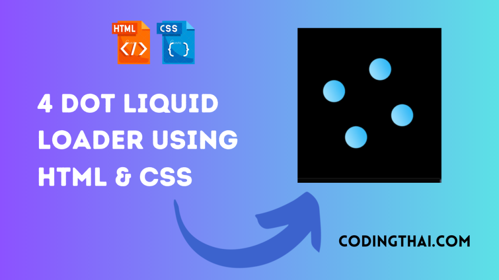
In this project, we have simply used HTML and CSS. As you see in the above output image we have taken 4 dots for loading using HTML and we animate it with CSS.
Now in the CSS section, we have designed the share button with hover and social media icon opens after clicking on the share buttons
| Language Used | HTML And CSS |
| External Link / Dependencies | No |
| Responsive | Yes |
There are 3 types of styles to connect CSS with HTML files. Inline CSS, Internal CSS, External CSS. For Inline CSS in this, we have to write the CSS code inside the HTML code using style Attribute elements. For internal CSS we have to use the Style tag in the Head section on HTML File. we Have used this Internal CSS in The below section. Last is External CSS for this we have to create another CSS File in the same folder this
Preview of Liquid Loading effect
In this preview, we have used internal CSS in the code. In the internal CSS, we have to write the code in the head section using the Style tag. We have to write the code in <Style> CSS code </style> in the Head section in the HTML file. This code is run in Codepen.io
See the Pen Liquid Loader Codingthai by Coding thai (@Codingthai) on CodePen.
You might like this
- Coder Animation Using HTML5 & CSS3
- SVG Text Animation Using HTML5 & CSS3
- Content Placeholder Using HTML5 CSS3 & JavaScript
- Responsive Sticky Navbar Using HTML5 CSS3 & JavaScript
Liquid Loading effect using HTML5 and CSS3 [Source code]
For Creating A liquid Loading effect using HTML5 and CSS3. First, you have to create three files (HTML and CSS) files with the named index.html and style.css in the same folder and you have to link the CSS files to HTML. after that paste, the HTML code in index.html, and lastly paste the CSS code in style.css that’s all after pasting the code.
First, you have to create an HTML file with the named index.html and paste the below HTML code on it and save it. Remember to give a .html extension to the HTML file.
<!DOCTYPE html>
<!--Codingthai.com-->
<html lang="en" >
<head>
  <meta charset="UTF-8">
  <title>--Codingthai - Liquid Loader  💧</title>
  <link rel="preconnect" href="https://fonts.gstatic.com">
<link href="https://fonts.googleapis.com/css2?family=Condiment&display=swap" rel="stylesheet"><link rel="stylesheet" href="./style.css">

</head>
<body>
<!-- partial:index.partial.html -->
<div class="container">
  <div class="liquid"></div>
  <div class="liquid"></div>
  <div class="liquid"></div>
  <div class="liquid"></div>
</div>
<svg>
  <filter id="gooey">
    <feGaussianBlur in="SourceGraphic" stdDeviation="10" />
    <feColorMatrix values="
        1 0 0 0 0
        0 1 0 0 0
        0 0 1 0 0
        0 0 0 20 -10
        " />
  </filter>
</svg>
<!-- partial -->

</body>
</html>
After pasting the HTML code, Now have to create a second CSS file with the named style.css. Paste the below code on it and save it. Again remember to give a .css extension to the CSS file.
body {
  background: #000;
  display: flex;
  justify-content: center;
  align-items: center;
  min-height: 100vh;
  overflow: hidden;
}
.container {
  position: relative;
  width: 250px;
  height: 250px;
  animation: rotate 4s ease-out infinite;
  filter: url("#gooey");
}
@keyframes rotate {
  0% {
    transform: rotate(360deg);
  }
  50% {
    transform: rotate(360deg);
  }
  100% {
    transform: rotate(0deg);
  }
}
.container .liquid {
  position: absolute;
  top: 50%;
  left: 50%;
  transform: translate(-50%, -50%);
  background: linear-gradient(45deg, #c7eeff, #03a9f4);
  width: 80px;
  height: 80px;
  border-radius: 50%;
  --ani_dur: 4s;
}
.container .liquid:nth-child(1) {
  top: 0;
  animation: animate1 var(--ani_dur) linear infinite;
}
.container .liquid:nth-child(2) {
  left: 0;
  animation: animate2 var(--ani_dur) linear infinite;
}
.container .liquid:nth-child(3) {
  left: 100%;
  animation: animate3 var(--ani_dur) linear infinite;
}
.container .liquid:nth-child(4) {
  top: 100%;
  animation: animate4 var(--ani_dur) linear infinite;
}
@keyframes animate1 {
  0% {
    top: 0;
  }
  50% {
    top: 100%;
  }
  100% {
    top: 100%;
  }
}
@keyframes animate2 {
  0% {
    left: 0;
  }
  50% {
    left: 100%;
  }
  100% {
    left: 100%;
  }
}
@keyframes animate3 {
  0% {
    left: 100%;
  }
  50% {
    left: 0;
  }
  100% {
    left: 0;
  }
}
@keyframes animate4 {
  0% {
    top: 100%;
  }
  50% {
    top: 0;
  }
  100% {
    top: 0;
  }
}
svg {
  width: 0;
  height: 0;
}
That’s all after pasting the code now your code will be successfully run. If you get any kind of error/problem in the code just comment or contact me on social media
Output Result
| Written By | @codingthai |
| Code By | @narendra-chand |