Hello, learner today In this blog post, We will be creating a Square Navigation Bar using HTML5 and CSS3. In the past post, we have created many projects one of them is the Liquid Loading effect using HTML5 and CSS3. With Out wasting time Now it is time to create Square Navigation Bar.
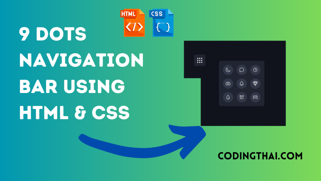
The Navigation Bar is now important to both users and the website’s creator as its most crucial section. Every website needs Navbar for user improvement. Nav bar content links to the other page of the same website. that is why the navbar is important to the user. There are different types of Navbar. We have created a square Navigation Bar using HTML5 and CSS3 only
In this project, we have simply used HTML and CSS. As you see in the Below output Source code. In the HTML source code, We have created a Div tag and Class it Navigation inside the body tag. Inside the Div tag, We give Spam tag for the icon. after putting the icon We use CSS to design it.
When you click in the square box it opens like the water drop and gives a 3 by 3 icon menu. If you move your mouse to the icon it changes the color to green. if you click on the icon it goes back to a square box
| Language Used | HTML And CSS |
| Responsive | Yes |
There are 3 types of styles to connect CSS with HTML files. Inline CSS, Internal CSS, External CSS. For Inline CSS in this, we have to write the CSS code inside the HTML code using style Attribute elements. For internal CSS we have to use the Style tag in the Head section on HTML File. we Have used this Internal CSS in The below section. Last is External CSS for this we have to create another CSS File in the same folder this
Preview of Square Navigation Bar
In this preview, we have used internal CSS in the code. In the internal CSS, we have to write the code in the head section using the Style tag. We have to write the code in <Style> CSS code </style> in the Head section in the HTML file. This code is run in Codepen.io
See the Pen 9 Dots Navigation Bar Codingthai.com by Coding thai (@Codingthai) on CodePen.
You might like this
- Coder Animation Using HTML5 & CSS3
- SVG Text Animation Using HTML5 & CSS3
- Content Placeholder Using HTML5 CSS3 & JavaScript
- Enjoy Code Animation Using HTML5 & CSS3
Square Navigation Bar using HTML5 and CSS3 [Source code]
For Creating A Square Navigation Bar using HTML5 and CSS3. First, you have to create three files (HTML and CSS) files with the named index.html and style.css in the same folder and you have to link the CSS files to HTML. after that paste, the HTML code in index.html, and lastly paste the CSS code in style.css that’s all after pasting the code.
First, you have to create an HTML file with the named index.html and paste the below HTML code on it and save it. Remember to give a .html extension to the HTML file.
<!DOCTYPE html>
<!--Codingthai.com-->
<html lang="en">

<head>
    <meta charset="UTF-8">
    <meta http-equiv="X-UA-Compatible" content="IE=edge">
    <meta name="viewport" content="width=device-width, initial-scale=1.0">
    <title>9 Dots Menu --Codingthai</title>
    <link rel="stylesheet" href="style.css">
</head>

<body>
    <div class="navigation">
        <span style="--i:0;--x:-1;--y:0;">
            <ion-icon name="camera-outline"></ion-icon>
        </span>
        <span style="--i:1;--x:1;--y:0;">
            <ion-icon name="diamond-outline"></ion-icon>
        </span>
        <span style="--i:2;--x:0;--y:-1;">
            <ion-icon name="chatbubble-outline"></ion-icon>
        </span>
        <span style="--i:3;--x:0;--y:1;">
            <ion-icon name="alarm-outline"></ion-icon>
        </span>
        <span style="--i:4;--x:1;--y:1;">
            <ion-icon name="game-controller-outline"></ion-icon>
        </span>
        <span style="--i:5;--x:-1;--y:-1;">
            <ion-icon name="moon-outline"></ion-icon>
        </span>
        <span style="--i:6;--x:0;--y:0;">
            <ion-icon name="notifications-outline"></ion-icon>
        </span>
        <span style="--i:7;--x:-1;--y:1;">
            <ion-icon name="water-outline"></ion-icon>
        </span>
        <span style="--i:8;--x:1;--y:-1;">
            <ion-icon name="time-outline"></ion-icon>
        </span>
    </div>

    <!-- ========= Sctipt ======== -->
    <script>
        const navigation = document.querySelector(".navigation");

        navigation.addEventListener("click", () => {
            navigation.classList.toggle("active");
        })
    </script>

    <script type="module" src="https://unpkg.com/ionicons@5.5.2/dist/ionicons/ionicons.esm.js"></script>
    <script nomodule src="https://unpkg.com/ionicons@5.5.2/dist/ionicons/ionicons.js"></script>
</body>

</html>
After pasting the HTML code, Now have to create a second CSS file with the named style.css. Paste the below code on it and save it. Again remember to give a .css extension to the CSS file.
*{
    margin: 0;
    padding: 0;
    box-sizing: border-box;
}

body{
    display: flex;
    justify-content: center;
    align-items: center;
    min-height: 100vh;
    background: #10131c;
}

.navigation{
    position: relative;
    width: 70px;
    height: 70px;
    background: #212532;
    border-radius: 10px;
    cursor: pointer;
    display: flex;
    justify-content: center;
    align-items: center;
    transition: .5s;
    transition-delay: .8s;
}
.navigation.active{
    width: 200px;
    height: 200px;
    transition-delay: 0s;
}

.navigation span{
    position: absolute;
    width: 7px;
    height: 7px;
    display: flex;
    justify-content: center;
    align-items: center;
    background: #fff;
    border-radius: 50%;
    transform: translate(calc(12px * var(--x)), calc(12px * var(--y)));
    transition: transform .5s, width .5s, height .5s, background .5s;
    transition-delay: calc(.1s * var(--i));
}
.navigation.active span{
    width: 45px;
    height: 45px;
    background: #333849;
    transform: translate(calc(60px * var(--x)), calc(60px * var(--y)));
}

.navigation span ion-icon{
    transition: .5s;
    font-size: 0em;
}

.navigation.active span ion-icon{
    font-size: 1.35em;
    color: #fff;
}
.navigation.active span:hover ion-icon{
    color: #2dfc52;
    filter: drop-shadow(0 0 2px #2dfc52)
     drop-shadow(0 0 5px #2dfc52)
     drop-shadow(0 0 15px #2dfc52);
}
That’s all after pasting the code now your code will be successfully run. If you get any kind of error/problem in the code just comment or contact me on social media
Output Result
| Written By | @codingthai |
| Code By | @narendra-chand |