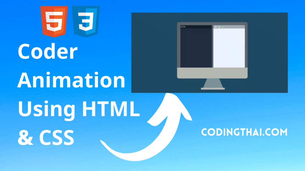
Hello, learner today In this blog post, We will be creating a Code Animation Using HTML5 & CSS3. In the past post, we have created many projects one of them is Coder Animation Using HTML5 & CSS3. With Out wasting time Now it is time to create a Code Animation. This code is written by Judith Neumann.

In this Project, we have created a Custome pad with animation inside. This animation is created by using CSS3 and HTML5. Inside the HTML5 we have created a simple division of the Tablet using the <div> tag and inside the <div> tag we have created the simple list using <ul> and <li> tags that are all in the HTML file the Main creation of animation us CSS3
Now in the CSS file, we have a color background of pink. we have to change the position of the Tablet in the center. For creating the animation we have to use
-Moz-animation: corre5 4s linear infinite;
-WebKit-animation: corre5 4s linear infinite;
animation:corre5 4s linear infinite;
This tag creates the animation for infinite time. besides this, we have used the position, Height, width, margin, and background tag of designs the animation and position the animation in right place with different height width, and margins between them. as you see the animation there are different animations with different background color this is done by using the Background color.
| Code By | Judith Neumatnag |
| Language Used | HTML And CSS |
| External Link / Dependencies | No |
| Responsive | Yes |
There are 3 types of styles to connect CSS with HTML files. Inline CSS, Internal CSS, External CSS. For Inline CSS in this, we have to write the CSS code inside the HTML code using style Attribute elements. For internal CSS we have to use the Style tag in the Head section on HTML File. we Have used this Internal CSS in The below section. Last is External CSS for this we have to create another CSS File in the same folder this
Preview of Code Animation
In this preview, we have used internal CSS in the code. In the internal CSS, we have to write the code in the head section using the Style tag. We have to write the code in <Style> CSS code </style> in the Head section in the HTML file. You can Copy and Run the preview in the Top left of the code
<!DOCTYPE html>
<!--Codingthai.com-->
<html lang="en">
  <head>
    <meta charset="UTF-8" />
    <meta name="viewport" content="width=device-width, initial-scale=1.0" />
    <link rel="stylesheet" href="style.css" />
    <title> Enjoy Code Animation </title>
    <style>
      *{
 margin:0;
  padding:0;
}
body{
  background:#ef4f59;
}
.container{
  position:relative;
  width:700px;
  margin:212px auto;
}
.celu{
  position:absolute;
  width:400px;
  height: 500px;
  background:#ecefe8;
  margin:0px 121px;
  border-radius:30px;
  border-top:50px solid #212121;
   border-bottom:50px solid #212121;
  border-left:21px solid #212121;
  border-right:21px solid #212121;
}
.celu::before{
  content:"";
    display:block;
  width:21px;
  height:21px;
  border-radius:100%;
  background:gray;
  margin:-35px 192px
}
.celu::after{
  content:"";
    display:block;
  width:30px;
  height:30px;
  border-radius:100%;
  background:gray;
  margin:560px 192px
}
.s1{
  position:absolute;
  width:172px;
  height:132px;
  background:white;
  margin:70px 12px;
  overflow:hidden;
}
ul.tres{
  position:absolute;
  width:152px;
  height: 353px;
  list-style:none;
  margin:0 9px;
  -moz-animation: textmoveup 9s linear infinite;
  -webkit-animation: textmoveup 9s linear infinite;
   animation: textmoveup 9s linear infinite; }

ul.tres li{
  display:block;
}
ul.tres li:nth-child(1){
  width:152px;
  height:12px;
  background:gray;
  margin:21px 0px;
}
ul.tres li:nth-child(2){
  width:152px;
  height:60px;
  background:#ffdf3e;
  margin:21px 0px;
}
ul.tres li:nth-child(3){
  width:152px;
  height:12px;
  background:gray;
  margin:12px 0px;
}
ul.tres li:nth-child(4){
  content:"";
  display:block;
  width:152px;
  height:60px;
  background:#00b36d;;
  margin:21px 0px;
}
ul.tres li:nth-child(5){
  width:152px;
  height:12px;
  background:gray;
  margin:12px 0px;
}
ul.tres li:nth-child(6){
  content:"";
  display:block;
  width:152px;
  height:60px;
  background:#ef6e54;
  margin:21px 0px;
}
.s2{
  position:absolute;
  width:172px;
  height:132px;
  background:#00b36d;
  margin:70px 217px;
  overflow:hidden;
}
.s2::before{
  content:"";
  display:block;
  width:12px;
  height:45px;
  background:#333;
  margin:0px 132px;
}
.trian{
  position:absolute;
  width: 0;
   height: 0;
   border-top: 12px solid #333;
   border-left: 7px solid transparent;
  margin: 0 137px;
}
.trian::before{
  content:"";
  display:block;
  width: 0;
   height: 0;
   border-top: 12px solid #333;
   border-right: 7px solid transparent;
  margin: -12px -12px;
}
.s3{
  position:absolute;
  width:172px;
  height:132px;
  background:white;
  margin:221px 12px;
  overflow:hidden;
}
.s3::before{
  content:"";
  display:block;
  width:60px;
  height:50px;
  background:gray;
  margin:12px 9px;
}
.s3::after{
 content:"";
  display:block;
  width:83px;
  height:50px;
  background:#eceec8;
  margin:-62px 80px;
}
ul.redon{
  position:absolute;
  display:block;
  width: 152px;
  margin: -3px 10px;
  list-style:none;
}
ul.redon li{
  display:block;
  width:152px;
  height:5px;
  background:gray;
  margin:12px 0px;
}
.c1{
  position:absolute;
  width:14px;
  height:14px;
  border-radius:100%;
  background:#ffdf3e;
  margin:-3px 0px;
  -moz-animation: corre 3s alternate infinite;
  -webkit-animation: corre 3s alternate infinite;
   animation: corre 3s alternate infinite;
}
.c2{
  position:absolute;
  width:14px;
  height:14px;
  border-radius:100%;
  background:#00b36d;
  margin:-3px 132px;
  -moz-animation: corre 3s alternate infinite;
  -webkit-animation: corre 3s alternate infinite;
   animation:corre 3s alternate infinite;
}
.c3{
  position:absolute;
  width:14px;
  height:14px;
  border-radius:100%;
  background:#ef6e54;
  margin:-3px 0px;
  -moz-animation: corre 3s alternate infinite;
  -webkit-animation: corre 3s alternate infinite;
  animation: corre 3s alternate infinite;
}
.s4{
  position:absolute;
  width:172px;
  height:132px;
  background:transparent;
  margin:221px 217px;
  overflow:hidden;

}
.s4::before{
  content:"";
  display:block;
  width: 50px;
  height:50px;
  border-radius:100%;
  background:rgba(255, 255, 255, .3);
  margin:39px 60px;
}
.s4::after{
  content:"";
  display:block;
  width: 0;
  height: 0;
  border-top: 12px solid transparent;
  border-left: 16px solid white;
  border-bottom: 12px solid transparent;
  margin:-75px 80px;
}


.s4::after{
  content:"";
  display:block;
  width: 0;
    height: 0;
    border-top: 12px solid transparent;
    border-left: 16px solid white;
    border-bottom: 12px solid transparent;
  margin:-78px 80px;
}
.s44{
  position:absolute;
  width:172px;
  height:132px;
  background:white;
  margin:-128px 0px;
  overflow:hidden;
}
.trian3{
  position:absolute;
  width: 0;
  height: 0;
  border-left: 50px solid transparent;
  border-right: 50px solid transparent;
  border-bottom: 90px solid #00b36d;
  margin: 35px 21px;
  -moz-animation: arriba 2s alternate infinite;
  -webkit-animation: arriba 2s alternate infinite;
  animation:arriba 2s alternate infinite;
}
.trian5{
  position:absolute;
  width: 0;
  height: 0;
  border-left: 40px solid transparent;
  border-right: 40px solid transparent;
  border-bottom: 70px solid #ef6e54;
  margin: 121px 70px;
  -moz-animation: arriba3 2s alternate infinite;
  -webkit-animation: arriba3 2s alternate infinite;
  animation:arriba3 2s alternate infinite;
}

.sol{
  position:absolute;
  width:30px;
  height:30px;
  border-radius:100%;
  background:#ffdf3e;
  margin:30px -50px;
  -moz-animation: costado 2s alternate infinite;
    -webkit-animation: costado 2s alternate infinite;
    animation:costado 2s alternate infinite;
}
.youtub{
  position:relative;
  display:block;
  width:172px;
  height:9px;
  background:gray;
  margin:-5px 0px;
}
.boton{
  position:absolute;
  width:12px;
  height:12px;
  border-radius:100%;
  background:#ff6666;
  margin:-3px 0px;
  -moz-animation: corre5 4s linear infinite;
  -webkit-animation: corre5 4s linear infinite;
   animation:corre5 4s linear infinite;
}
.s5{
  position:absolute;
  width:172px;
  height:30px;
  background:white;
  margin:373px 12px;

}
ul.star{
  position:absolute;
  width:177px;
  height:30px;
  margin:0px -3px;
  list-style:none;
}
ul.star li{
  display:inline-block;
  margin: -3px 4px;
}
ul.star li:nth-child(1){
   width: 0px;
   height: 0px;
   border-right:  12px solid transparent;
   border-bottom: 7px  solid #00b36d;
   border-left:   12px solid transparent;
   -moz-transform:    rotate(35deg);
   -webkit-transform: rotate(35deg);
   transform: rotate(35deg);
   -moz-animation: agranda 3s linear infinite;
   -webkit-animation: agranda 3s linear infinite;
    animation:agranda 3s linear infinite;

}
ul.star li:nth-child(1)::before {
     content:"";
     display: block;
     color: blue;
     top: 0px;
     left: -10px;
     width: 0px;
     height: 0px;
     border-right: 4px solid transparent;
     border-bottom: 12px solid #00b36d;
     border-left:4px solid transparent;
     -webkit-transform: rotate(-35deg);
     -moz-transform:    rotate(-35deg);
     transform: rotate(-35deg);
     margin:-7px -7px;
   }
  ul.star li:nth-child(1)::after {
     position: absolute;
     display: block;
     color: red;
     top: 0px;
     left: -10px;
     width: 0px;
     height: 0px;
     border-right: 12px solid transparent;
     border-bottom: 7px solid #00b36d;
     border-left: 12px solid transparent;
     -webkit-transform: rotate(-70deg);
     -moz-transform:    rotate(-70deg);
     transform:      rotate(-70deg);
     content: '';
    margin:0px -2px;
   }
ul.star li:nth-child(2){

   width: 0px;
   height: 0px;
   border-right:  12px solid transparent;
   border-bottom: 7px  solid #ef6e54;
   border-left:   12px solid transparent;
   -moz-transform:    rotate(35deg);
   -webkit-transform: rotate(35deg);
    transform:      rotate(35deg);
  -moz-animation: agranda 3.1s linear infinite;
   -webkit-animation: agranda 3.1s linear infinite;
    animation:agranda 3.1s linear infinite;

}
ul.star li:nth-child(2)::before {
     content:"";
     display: block;
     color: blue;
     top: 0px;
     left: -10px;
     width: 0px;
     height: 0px;
     border-right: 4px solid transparent;
     border-bottom: 12px solid #ef6e54;
     border-left:4px solid transparent;
     -webkit-transform: rotate(-35deg);
     -moz-transform:    rotate(75deg);
     -ms-transform:     rotate(75deg);
     -o-transform:      rotate(0eg);
     margin:-7px -7px;
   }
  ul.star li:nth-child(2)::after {
     position: absolute;
     display: block;
     color: red;
     top: 0px;
     left: -10px;
     width: 0px;
     height: 0px;
     border-right: 12px solid transparent;
     border-bottom: 7px solid #ef6e54;
     border-left: 12px solid transparent;
     -webkit-transform: rotate(-70deg);
     -moz-transform:    rotate(-70deg);
	transform:      rotate(-70deg);
     content: '';
    margin:0px -2px;
   }
ul.star li:nth-child(3){
   width: 0px;
   height: 0px;
   border-right:  12px solid transparent;
   border-bottom: 7px  solid #00b36d;
   border-left:   12px solid transparent;
   -moz-transform:    rotate(35deg);
   -webkit-transform: rotate(35deg);
     transform:      rotate(35deg);
  -moz-animation: agranda 3.2s linear infinite;
  -webkit-animation: agranda 3.2s linear infinite;
   animation:agranda 3.2s linear infinite;
}
ul.star li:nth-child(3)::before {
     content:"";
     display: block;
     color: blue;
     top: 0px;
     left: -10px;
     width: 0px;
     height: 0px;
     border-right: 4px solid transparent;
     border-bottom: 12px solid #00b36d;
     border-left:4px solid transparent;
     -webkit-transform: rotate(-35deg);
     -moz-transform:    rotate(-35deg);
     transform:      rotate(-35deg);
     margin:-7px -7px;
   }
  ul.star li:nth-child(3)::after {
     position: absolute;
     display: block;
     color: red;
     top: 0px;
     left: -10px;
     width: 0px;
     height: 0px;
     border-right: 12px solid transparent;
     border-bottom: 7px solid #00b36d;
     border-left: 12px solid transparent;
     -webkit-transform: rotate(-70deg);
     -moz-transform:    rotate(-70deg);
     transform:      rotate(-70deg);
     content: '';
    margin:0px -2px;
   }
ul.star li:nth-child(4){
   width: 0px;
   height: 0px;
   border-right:  12px solid transparent;
   border-bottom: 7px  solid #ef6e54;
   border-left:   12px solid transparent;
   -moz-transform:    rotate(35deg);
   -webkit-transform: rotate(35deg);
   transform:      rotate(35deg);
  -moz-animation: agranda 3.3s linear infinite;
   -webkit-animation: agranda 3.3s linear infinite;
   animation:agranda 3.3s linear infinite;
}
ul.star li:nth-child(4)::before {
     content:"";
     display: block;
     color: blue;
     top: 0px;
     left: -10px;
     width: 0px;
     height: 0px;
     border-right: 4px solid transparent;
     border-bottom: 12px solid #ef6e54;
     border-left:4px solid transparent;
     -webkit-transform: rotate(-35deg);
     -moz-transform:    rotate(-35deg);
     transform:      rotate(-35deg);
     margin:-7px -7px;
   }
  ul.star li:nth-child(4)::after {
     position: absolute;
     display: block;
     color: red;
     top: 0px;
     left: -10px;
     width: 0px;
     height: 0px;
     border-right: 12px solid transparent;
     border-bottom: 7px solid #ef6e54;
     border-left: 12px solid transparent;
     -webkit-transform: rotate(-70deg);
     -moz-transform:    rotate(-70deg);
     transform:      rotate(-70deg);
     content: '';
    margin:0px -2px;
   }
ul.star li:nth-child(5){
   width: 0px;
   height: 0px;
   border-right:  12px solid transparent;
   border-bottom: 7px  solid #00b36d;
   border-left:   12px solid transparent;
   -moz-transform:    rotate(35deg);
   -webkit-transform: rotate(35deg);
   transform:      rotate(35deg);
  -moz-animation: agranda 3.4s linear infinite;
   -webkit-animation: agranda 3.4s linear infinite;
    animation:agranda 3.4s linear infinite;
}
ul.star li:nth-child(5)::before {
     content:"";
     display: block;
     color: blue;
     top: 0px;
     left: -10px;
     width: 0px;
     height: 0px;
     border-right: 4px solid transparent;
     border-bottom: 12px solid #00b36d;
     border-left:4px solid transparent;
     -webkit-transform: rotate(-35deg);
     -moz-transform:    rotate(-35deg);
	transform:      rotate(-35deg);
     margin:-7px -7px;
     }
  ul.star li:nth-child(5)::after {
     position: absolute;
     display: block;
     color: red;
     top: 0px;
     left: -10px;
     width: 0px;
     height: 0px;
     border-right: 12px solid transparent;
     border-bottom: 7px solid #00b36d;
     border-left: 12px solid transparent;
     -webkit-transform: rotate(-70deg);
     -moz-transform:    rotate(-70deg);
      transform:      rotate(-70deg);
     content: '';
    margin:0px -2px;
   }
.s6{
  position:absolute;
  width:172px;
  height:30px;
  background:#ef6e54;
  margin:373px 217px;

}
.s2 h1{
  color:white;
  font-size:2.1em;
}
h1{
  font-family:Verdana;
  font-size:1.2em;
  text-align:center;
  color:#333;
}
.s7{
  position:absolute;
  width:182px;
  height:112px;
  margin: 421px 112px;
  overflow:hidden;
}
ul.sli{
  position:absolute;
  width:590px;
  height:112px;
  list-style:none;
  -moz-animation: sli 12s linear infinite;
  -webkit-animation:sli 12s linear infinite;
  animation:sli 12s linear infinite;
  animation-delay:3s;
  -moz-animation-delay:3s;
  -webkit-animation-delay:3s;
}
ul.sli li{
  display:inline-block;
  width:172px;
  height:112px;
  background:white;
  margin-left:12px;
}
ul.sli li:nth-child(1){
  background:#ffdf3e;

}
ul.sli li:nth-child(1)::before,
ul.sli li:nth-child(2)::before,ul.sli li:nth-child(3)::before {
  content:"";
  display:block;
  width:90px;
  height:90px;
  border-radius:100%;
  background:white;
  margin: 12px 43px;
}
ul.sli li:nth-child(1)::after{
  content:"";
  display:block;
  width:21px;
  height:25px;
  border-radius:100%;
  background:#ef6e54;
  margin: -50px 77px;
}
ul.sli li:nth-child(2){
  background:#00b36d;
}
ul.sli li:nth-child(2)::after{
   content:"";
  display:block;
  width:30px;
  height:5px;

  background:#ef6e54;
  margin: -40px 73px;

}
ul.sli li:nth-child(3){
  background:#ef6e54;
}
ul.sli li:nth-child(3)::after{
  content:"";
  display:block;
  width:30px;
  height:16px;
  border-radius: 0 0 30px 30px;
  background:#ef6e54;
  margin: -40px 73px;

}

@-webkit-keyframes textmoveup {

  0% {margin-top:0px; }

  100% {margin-top: -221px; } }

@-moz-keyframes textmoveup {

  0% {margin-top:0px; }

  100% {margin-top: -221px; } }

@keyframes textmoveup {

   0% {margin-top:0px; }

  100% {margin-top: -221px; } }

@-webkit-keyframes corre {

  0% {
    }
  100% {
    margin-left: 50px; } }

@-moz-keyframes corre {

  0% {
    }


  100% {
    margin-left: 50px; } }
@keyframes corre {

  0% {
    }


  100% {
    margin-left: 50px; } }

@keyframes arriba {
    0% {margin-top: 192px;}
	50% {margin-top: 35px; }
	70% {margin-top: 35px;}
	75% {margin-top: 35px; }
	100% {margin-top: 35px; } }

@-webkit-keyframes arriba {
 0% {margin-top: 192px;}
	50% {margin-top: 35px; }
	70% {margin-top: 35px;}
	75% {margin-top: 35px; }
	100% {margin-top: 35px; } }

@-moz-keyframes arriba {
  0% {margin-top: 192px;}
	50% {margin-top: 35px; }
	70% {margin-top: 35px;}
	75% {margin-top: 35px; }
	100% {margin-top: 35px; } }

@keyframes arriba3{

  0% {margin-top: 152px;}
  50% {margin-top: 55px; }
  70% {margin-top: 55px;}
  75% {margin-top: 55px; }
  100% {margin-top: 55px; } }

@-webkit-keyframes arriba3{
  0% {margin-top: 152px;}
  50% {margin-top: 55px; }
  70% {margin-top: 55px;}
  75% {margin-top: 55px; }
  100% {margin-top: 55px; } }

@-moz-keyframes arriba3{
  0% {margin-top: 152px;}
  50% {margin-top: 55px; }
  70% {margin-top: 55px;}
  75% {margin-top: 55px; }
  100% {margin-top: 55px; } }

@keyframes costado {
    0% {margin: 30px -33px; }
  100% {margin:30px 12px;} }

@-webkit-keyframes costado {
     0% {margin: 30px -33px; }
  100% {margin:30px 12px;} }

@-moz-keyframes costado {
   0% {margin: 30px -33px; }
  100% {margin:30px 12px;} }

@keyframes  corre5{
    0% {margin-left:0px;}
  100% {margin-left: 159px;} }

@-webkit-keyframes  corre5{
    0% {margin-left:0px;}
  100% {margin-left: 159px;} }

@-moz-keyframes  corre5{
    0% {margin-left:0px;}
  100% {margin-left: 159px;} }

@keyframes  agranda{
   0% {opacity:.3;}
  100% {opacity:1;} }

@-webkit-keyframes  agranda{
	0% {opacity:.3;}
  100% {opacity:1;} }

@-moz-keyframes  agranda{
   0% {opacity:.3;}
  100% {opacity:1;} }

@keyframes sli {

  0% {
    }


  100% {
    margin-left:-387px
   } }
@-webkit-keyframes sli {

  0% {
    }

  100% {
    margin-left:-387px
   } }
@-moz-keyframes sli {

  0% {
    }
  100% {
    margin-left:-387px
   } }
    </style>
  </head>
  <body>
<div class="container">
  <div class="celu">
    <div class="s1">

      <ul class="tres">
        <li></li>
        <li></li>
        <li></li>
        <li></li>
         <li></li>
        <li></li>
      </ul></div>
    <div class="s2"><span class="trian"></span><h1>Hello</h1></div>
    <div class="s3">
      <ul class="redon">
        <li><div class="c1"></div></li>
        <li><div class="c2"></div></li>
        <li><div class="c3"></div></li>
      </ul>
    </div>
    <div class="s4"><div class="s44">
      <span class="sol"></span>
      <span class="trian3"></span>
      <span class="trian5"></span>
      </div>
      <div class="youtub">
      <span class="boton"></span>
      </div></div>
    <div class="s5">
      <ul class="star">
        <li></li>
        <li></li>
        <li></li>
        <li></li>
        <li></li>
      </ul>
    </div>
    <div class="s6"><h1>Enjoy</h1></div>
    <div class="s7">
      <ul class="sli">
        <li></li>
        <li></li>
        <li></li>
      </ul>

    </div>
  </div>
</div>
  </body>
</html>
You might like this
- Coder Animation Using HTML5 & CSS3
- SVG Text Animation Using HTML5 & CSS3
- Content Placeholder Using HTML5 CSS3 & JavaScript
- Responsive Sticky Navbar Using HTML5 CSS3 & JavaScript
Code Animation Using HTML5 &CSS3 [Source code]
For Creating a Code Animation Using HTML5 & CSS3. First, you have to create three files (HTML and CSS) files with the named index.html and style.css in the same folder and you have to link the CSS files to HTML. after that paste, the HTML code in index.html, and lastly paste the CSS code in style.css that’s all after pasting the code.
First, you have to create an HTML file with the named index.html and paste the below HTML code on it and save it. Remember to give a .html extension to the HTML file.
<!DOCTYPE html>
<!--Codingthai.com-->
<html lang="en">
  <head>
    <meta charset="UTF-8" />
    <meta name="viewport" content="width=device-width, initial-scale=1.0" />
    <link rel="stylesheet" href="style.css" />
    <title> Enjoy Code Animation </title>
  </head>
  <body>
<div class="container">
  <div class="celu">
    <div class="s1">

      <ul class="tres">
        <li></li>
        <li></li>
        <li></li>
        <li></li>
         <li></li>
        <li></li>
      </ul></div>
    <div class="s2"><span class="trian"></span><h1>Hello</h1></div>
    <div class="s3">
      <ul class="redon">
        <li><div class="c1"></div></li>
        <li><div class="c2"></div></li>
        <li><div class="c3"></div></li>
      </ul>
    </div>
    <div class="s4"><div class="s44">
      <span class="sol"></span>
      <span class="trian3"></span>
      <span class="trian5"></span>
      </div>
      <div class="youtub">
      <span class="boton"></span>
      </div></div>
    <div class="s5">
      <ul class="star">
        <li></li>
        <li></li>
        <li></li>
        <li></li>
        <li></li>
      </ul>
    </div>
    <div class="s6"><h1>Enjoy</h1></div>
    <div class="s7">
      <ul class="sli">
        <li></li>
        <li></li>
        <li></li>
      </ul>

    </div>
  </div>
</div>
  </body>
</html>
After pasting the HTML code, Now have to create a second CSS file with the named style.css. Paste the below code on it and save it. Again remember to give a .css extension to the CSS file.
*{
 margin:0;
  padding:0;
}
body{
  background:#ef4f59;
}
.container{
  position:relative;
  width:700px;
  margin:212px auto;
}
.celu{
  position:absolute;
  width:400px;
  height: 500px;
  background:#ecefe8;
  margin:0px 121px;
  border-radius:30px;
  border-top:50px solid #212121;
   border-bottom:50px solid #212121;
  border-left:21px solid #212121;
  border-right:21px solid #212121;
}
.celu::before{
  content:"";
    display:block;
  width:21px;
  height:21px;
  border-radius:100%;
  background:gray;
  margin:-35px 192px
}
.celu::after{
  content:"";
    display:block;
  width:30px;
  height:30px;
  border-radius:100%;
  background:gray;
  margin:560px 192px
}
.s1{
  position:absolute;
  width:172px;
  height:132px;
  background:white;
  margin:70px 12px;
  overflow:hidden;
}
ul.tres{
  position:absolute;
  width:152px;
  height: 353px;
  list-style:none;
  margin:0 9px;
  -moz-animation: textmoveup 9s linear infinite;
  -webkit-animation: textmoveup 9s linear infinite;
   animation: textmoveup 9s linear infinite; }

ul.tres li{
  display:block;
}
ul.tres li:nth-child(1){
  width:152px;
  height:12px;
  background:gray;
  margin:21px 0px;
}
ul.tres li:nth-child(2){
  width:152px;
  height:60px;
  background:#ffdf3e;
  margin:21px 0px;
}
ul.tres li:nth-child(3){
  width:152px;
  height:12px;
  background:gray;
  margin:12px 0px;
}
ul.tres li:nth-child(4){
  content:"";
  display:block;
  width:152px;
  height:60px;
  background:#00b36d;;
  margin:21px 0px;
}
ul.tres li:nth-child(5){
  width:152px;
  height:12px;
  background:gray;
  margin:12px 0px;
}
ul.tres li:nth-child(6){
  content:"";
  display:block;
  width:152px;
  height:60px;
  background:#ef6e54;
  margin:21px 0px;
}
.s2{
  position:absolute;
  width:172px;
  height:132px;
  background:#00b36d;
  margin:70px 217px;
  overflow:hidden;
}
.s2::before{
  content:"";
  display:block;
  width:12px;
  height:45px;
  background:#333;
  margin:0px 132px;
}
.trian{
  position:absolute;
  width: 0;
   height: 0;
   border-top: 12px solid #333;
   border-left: 7px solid transparent;
  margin: 0 137px;
}
.trian::before{
  content:"";
  display:block;
  width: 0;
   height: 0;
   border-top: 12px solid #333;
   border-right: 7px solid transparent;
  margin: -12px -12px;
}
.s3{
  position:absolute;
  width:172px;
  height:132px;
  background:white;
  margin:221px 12px;
  overflow:hidden;
}
.s3::before{
  content:"";
  display:block;
  width:60px;
  height:50px;
  background:gray;
  margin:12px 9px;
}
.s3::after{
 content:"";
  display:block;
  width:83px;
  height:50px;
  background:#eceec8;
  margin:-62px 80px;
}
ul.redon{
  position:absolute;
  display:block;
  width: 152px;
  margin: -3px 10px;
  list-style:none;
}
ul.redon li{
  display:block;
  width:152px;
  height:5px;
  background:gray;
  margin:12px 0px;
}
.c1{
  position:absolute;
  width:14px;
  height:14px;
  border-radius:100%;
  background:#ffdf3e;
  margin:-3px 0px;
  -moz-animation: corre 3s alternate infinite;
  -webkit-animation: corre 3s alternate infinite;
   animation: corre 3s alternate infinite;
}
.c2{
  position:absolute;
  width:14px;
  height:14px;
  border-radius:100%;
  background:#00b36d;
  margin:-3px 132px;
  -moz-animation: corre 3s alternate infinite;
  -webkit-animation: corre 3s alternate infinite;
   animation:corre 3s alternate infinite;
}
.c3{
  position:absolute;
  width:14px;
  height:14px;
  border-radius:100%;
  background:#ef6e54;
  margin:-3px 0px;
  -moz-animation: corre 3s alternate infinite;
  -webkit-animation: corre 3s alternate infinite;
  animation: corre 3s alternate infinite;
}
.s4{
  position:absolute;
  width:172px;
  height:132px;
  background:transparent;
  margin:221px 217px;
  overflow:hidden;

}
.s4::before{
  content:"";
  display:block;
  width: 50px;
  height:50px;
  border-radius:100%;
  background:rgba(255, 255, 255, .3);
  margin:39px 60px;
}
.s4::after{
  content:"";
  display:block;
  width: 0;
  height: 0;
  border-top: 12px solid transparent;
  border-left: 16px solid white;
  border-bottom: 12px solid transparent;
  margin:-75px 80px;
}


.s4::after{
  content:"";
  display:block;
  width: 0;
    height: 0;
    border-top: 12px solid transparent;
    border-left: 16px solid white;
    border-bottom: 12px solid transparent;
  margin:-78px 80px;
}
.s44{
  position:absolute;
  width:172px;
  height:132px;
  background:white;
  margin:-128px 0px;
  overflow:hidden;
}
.trian3{
  position:absolute;
  width: 0;
  height: 0;
  border-left: 50px solid transparent;
  border-right: 50px solid transparent;
  border-bottom: 90px solid #00b36d;
  margin: 35px 21px;
  -moz-animation: arriba 2s alternate infinite;
  -webkit-animation: arriba 2s alternate infinite;
  animation:arriba 2s alternate infinite;
}
.trian5{
  position:absolute;
  width: 0;
  height: 0;
  border-left: 40px solid transparent;
  border-right: 40px solid transparent;
  border-bottom: 70px solid #ef6e54;
  margin: 121px 70px;
  -moz-animation: arriba3 2s alternate infinite;
  -webkit-animation: arriba3 2s alternate infinite;
  animation:arriba3 2s alternate infinite;
}

.sol{
  position:absolute;
  width:30px;
  height:30px;
  border-radius:100%;
  background:#ffdf3e;
  margin:30px -50px;
  -moz-animation: costado 2s alternate infinite;
    -webkit-animation: costado 2s alternate infinite;
    animation:costado 2s alternate infinite;
}
.youtub{
  position:relative;
  display:block;
  width:172px;
  height:9px;
  background:gray;
  margin:-5px 0px;
}
.boton{
  position:absolute;
  width:12px;
  height:12px;
  border-radius:100%;
  background:#ff6666;
  margin:-3px 0px;
  -moz-animation: corre5 4s linear infinite;
  -webkit-animation: corre5 4s linear infinite;
   animation:corre5 4s linear infinite;
}
.s5{
  position:absolute;
  width:172px;
  height:30px;
  background:white;
  margin:373px 12px;

}
ul.star{
  position:absolute;
  width:177px;
  height:30px;
  margin:0px -3px;
  list-style:none;
}
ul.star li{
  display:inline-block;
  margin: -3px 4px;
}
ul.star li:nth-child(1){
   width: 0px;
   height: 0px;
   border-right:  12px solid transparent;
   border-bottom: 7px  solid #00b36d;
   border-left:   12px solid transparent;
   -moz-transform:    rotate(35deg);
   -webkit-transform: rotate(35deg);
   transform: rotate(35deg);
   -moz-animation: agranda 3s linear infinite;
   -webkit-animation: agranda 3s linear infinite;
    animation:agranda 3s linear infinite;

}
ul.star li:nth-child(1)::before {
     content:"";
     display: block;
     color: blue;
     top: 0px;
     left: -10px;
     width: 0px;
     height: 0px;
     border-right: 4px solid transparent;
     border-bottom: 12px solid #00b36d;
     border-left:4px solid transparent;
     -webkit-transform: rotate(-35deg);
     -moz-transform:    rotate(-35deg);
     transform: rotate(-35deg);
     margin:-7px -7px;
   }
  ul.star li:nth-child(1)::after {
     position: absolute;
     display: block;
     color: red;
     top: 0px;
     left: -10px;
     width: 0px;
     height: 0px;
     border-right: 12px solid transparent;
     border-bottom: 7px solid #00b36d;
     border-left: 12px solid transparent;
     -webkit-transform: rotate(-70deg);
     -moz-transform:    rotate(-70deg);
     transform:      rotate(-70deg);
     content: '';
    margin:0px -2px;
   }
ul.star li:nth-child(2){

   width: 0px;
   height: 0px;
   border-right:  12px solid transparent;
   border-bottom: 7px  solid #ef6e54;
   border-left:   12px solid transparent;
   -moz-transform:    rotate(35deg);
   -webkit-transform: rotate(35deg);
    transform:      rotate(35deg);
  -moz-animation: agranda 3.1s linear infinite;
   -webkit-animation: agranda 3.1s linear infinite;
    animation:agranda 3.1s linear infinite;

}
ul.star li:nth-child(2)::before {
     content:"";
     display: block;
     color: blue;
     top: 0px;
     left: -10px;
     width: 0px;
     height: 0px;
     border-right: 4px solid transparent;
     border-bottom: 12px solid #ef6e54;
     border-left:4px solid transparent;
     -webkit-transform: rotate(-35deg);
     -moz-transform:    rotate(75deg);
     -ms-transform:     rotate(75deg);
     -o-transform:      rotate(0eg);
     margin:-7px -7px;
   }
  ul.star li:nth-child(2)::after {
     position: absolute;
     display: block;
     color: red;
     top: 0px;
     left: -10px;
     width: 0px;
     height: 0px;
     border-right: 12px solid transparent;
     border-bottom: 7px solid #ef6e54;
     border-left: 12px solid transparent;
     -webkit-transform: rotate(-70deg);
     -moz-transform:    rotate(-70deg);
	transform:      rotate(-70deg);
     content: '';
    margin:0px -2px;
   }
ul.star li:nth-child(3){
   width: 0px;
   height: 0px;
   border-right:  12px solid transparent;
   border-bottom: 7px  solid #00b36d;
   border-left:   12px solid transparent;
   -moz-transform:    rotate(35deg);
   -webkit-transform: rotate(35deg);
     transform:      rotate(35deg);
  -moz-animation: agranda 3.2s linear infinite;
  -webkit-animation: agranda 3.2s linear infinite;
   animation:agranda 3.2s linear infinite;
}
ul.star li:nth-child(3)::before {
     content:"";
     display: block;
     color: blue;
     top: 0px;
     left: -10px;
     width: 0px;
     height: 0px;
     border-right: 4px solid transparent;
     border-bottom: 12px solid #00b36d;
     border-left:4px solid transparent;
     -webkit-transform: rotate(-35deg);
     -moz-transform:    rotate(-35deg);
     transform:      rotate(-35deg);
     margin:-7px -7px;
   }
  ul.star li:nth-child(3)::after {
     position: absolute;
     display: block;
     color: red;
     top: 0px;
     left: -10px;
     width: 0px;
     height: 0px;
     border-right: 12px solid transparent;
     border-bottom: 7px solid #00b36d;
     border-left: 12px solid transparent;
     -webkit-transform: rotate(-70deg);
     -moz-transform:    rotate(-70deg);
     transform:      rotate(-70deg);
     content: '';
    margin:0px -2px;
   }
ul.star li:nth-child(4){
   width: 0px;
   height: 0px;
   border-right:  12px solid transparent;
   border-bottom: 7px  solid #ef6e54;
   border-left:   12px solid transparent;
   -moz-transform:    rotate(35deg);
   -webkit-transform: rotate(35deg);
   transform:      rotate(35deg);
  -moz-animation: agranda 3.3s linear infinite;
   -webkit-animation: agranda 3.3s linear infinite;
   animation:agranda 3.3s linear infinite;
}
ul.star li:nth-child(4)::before {
     content:"";
     display: block;
     color: blue;
     top: 0px;
     left: -10px;
     width: 0px;
     height: 0px;
     border-right: 4px solid transparent;
     border-bottom: 12px solid #ef6e54;
     border-left:4px solid transparent;
     -webkit-transform: rotate(-35deg);
     -moz-transform:    rotate(-35deg);
     transform:      rotate(-35deg);
     margin:-7px -7px;
   }
  ul.star li:nth-child(4)::after {
     position: absolute;
     display: block;
     color: red;
     top: 0px;
     left: -10px;
     width: 0px;
     height: 0px;
     border-right: 12px solid transparent;
     border-bottom: 7px solid #ef6e54;
     border-left: 12px solid transparent;
     -webkit-transform: rotate(-70deg);
     -moz-transform:    rotate(-70deg);
     transform:      rotate(-70deg);
     content: '';
    margin:0px -2px;
   }
ul.star li:nth-child(5){
   width: 0px;
   height: 0px;
   border-right:  12px solid transparent;
   border-bottom: 7px  solid #00b36d;
   border-left:   12px solid transparent;
   -moz-transform:    rotate(35deg);
   -webkit-transform: rotate(35deg);
   transform:      rotate(35deg);
  -moz-animation: agranda 3.4s linear infinite;
   -webkit-animation: agranda 3.4s linear infinite;
    animation:agranda 3.4s linear infinite;
}
ul.star li:nth-child(5)::before {
     content:"";
     display: block;
     color: blue;
     top: 0px;
     left: -10px;
     width: 0px;
     height: 0px;
     border-right: 4px solid transparent;
     border-bottom: 12px solid #00b36d;
     border-left:4px solid transparent;
     -webkit-transform: rotate(-35deg);
     -moz-transform:    rotate(-35deg);
	transform:      rotate(-35deg);
     margin:-7px -7px;
     }
  ul.star li:nth-child(5)::after {
     position: absolute;
     display: block;
     color: red;
     top: 0px;
     left: -10px;
     width: 0px;
     height: 0px;
     border-right: 12px solid transparent;
     border-bottom: 7px solid #00b36d;
     border-left: 12px solid transparent;
     -webkit-transform: rotate(-70deg);
     -moz-transform:    rotate(-70deg);
      transform:      rotate(-70deg);
     content: '';
    margin:0px -2px;
   }
.s6{
  position:absolute;
  width:172px;
  height:30px;
  background:#ef6e54;
  margin:373px 217px;

}
.s2 h1{
  color:white;
  font-size:2.1em;
}
h1{
  font-family:Verdana;
  font-size:1.2em;
  text-align:center;
  color:#333;
}
.s7{
  position:absolute;
  width:182px;
  height:112px;
  margin: 421px 112px;
  overflow:hidden;
}
ul.sli{
  position:absolute;
  width:590px;
  height:112px;
  list-style:none;
  -moz-animation: sli 12s linear infinite;
  -webkit-animation:sli 12s linear infinite;
  animation:sli 12s linear infinite;
  animation-delay:3s;
  -moz-animation-delay:3s;
  -webkit-animation-delay:3s;
}
ul.sli li{
  display:inline-block;
  width:172px;
  height:112px;
  background:white;
  margin-left:12px;
}
ul.sli li:nth-child(1){
  background:#ffdf3e;

}
ul.sli li:nth-child(1)::before,
ul.sli li:nth-child(2)::before,ul.sli li:nth-child(3)::before {
  content:"";
  display:block;
  width:90px;
  height:90px;
  border-radius:100%;
  background:white;
  margin: 12px 43px;
}
ul.sli li:nth-child(1)::after{
  content:"";
  display:block;
  width:21px;
  height:25px;
  border-radius:100%;
  background:#ef6e54;
  margin: -50px 77px;
}
ul.sli li:nth-child(2){
  background:#00b36d;
}
ul.sli li:nth-child(2)::after{
   content:"";
  display:block;
  width:30px;
  height:5px;

  background:#ef6e54;
  margin: -40px 73px;

}
ul.sli li:nth-child(3){
  background:#ef6e54;
}
ul.sli li:nth-child(3)::after{
  content:"";
  display:block;
  width:30px;
  height:16px;
  border-radius: 0 0 30px 30px;
  background:#ef6e54;
  margin: -40px 73px;

}

@-webkit-keyframes textmoveup {

  0% {margin-top:0px; }

  100% {margin-top: -221px; } }

@-moz-keyframes textmoveup {

  0% {margin-top:0px; }

  100% {margin-top: -221px; } }

@keyframes textmoveup {

   0% {margin-top:0px; }

  100% {margin-top: -221px; } }

@-webkit-keyframes corre {

  0% {
    }
  100% {
    margin-left: 50px; } }

@-moz-keyframes corre {

  0% {
    }


  100% {
    margin-left: 50px; } }
@keyframes corre {

  0% {
    }


  100% {
    margin-left: 50px; } }

@keyframes arriba {
    0% {margin-top: 192px;}
	50% {margin-top: 35px; }
	70% {margin-top: 35px;}
	75% {margin-top: 35px; }
	100% {margin-top: 35px; } }

@-webkit-keyframes arriba {
 0% {margin-top: 192px;}
	50% {margin-top: 35px; }
	70% {margin-top: 35px;}
	75% {margin-top: 35px; }
	100% {margin-top: 35px; } }

@-moz-keyframes arriba {
  0% {margin-top: 192px;}
	50% {margin-top: 35px; }
	70% {margin-top: 35px;}
	75% {margin-top: 35px; }
	100% {margin-top: 35px; } }

@keyframes arriba3{

  0% {margin-top: 152px;}
  50% {margin-top: 55px; }
  70% {margin-top: 55px;}
  75% {margin-top: 55px; }
  100% {margin-top: 55px; } }

@-webkit-keyframes arriba3{
  0% {margin-top: 152px;}
  50% {margin-top: 55px; }
  70% {margin-top: 55px;}
  75% {margin-top: 55px; }
  100% {margin-top: 55px; } }

@-moz-keyframes arriba3{
  0% {margin-top: 152px;}
  50% {margin-top: 55px; }
  70% {margin-top: 55px;}
  75% {margin-top: 55px; }
  100% {margin-top: 55px; } }

@keyframes costado {
    0% {margin: 30px -33px; }
  100% {margin:30px 12px;} }

@-webkit-keyframes costado {
     0% {margin: 30px -33px; }
  100% {margin:30px 12px;} }

@-moz-keyframes costado {
   0% {margin: 30px -33px; }
  100% {margin:30px 12px;} }

@keyframes  corre5{
    0% {margin-left:0px;}
  100% {margin-left: 159px;} }

@-webkit-keyframes  corre5{
    0% {margin-left:0px;}
  100% {margin-left: 159px;} }

@-moz-keyframes  corre5{
    0% {margin-left:0px;}
  100% {margin-left: 159px;} }

@keyframes  agranda{
   0% {opacity:.3;}
  100% {opacity:1;} }

@-webkit-keyframes  agranda{
	0% {opacity:.3;}
  100% {opacity:1;} }

@-moz-keyframes  agranda{
   0% {opacity:.3;}
  100% {opacity:1;} }

@keyframes sli {

  0% {
    }


  100% {
    margin-left:-387px
   } }
@-webkit-keyframes sli {

  0% {
    }


  100% {
    margin-left:-387px
   } }
@-moz-keyframes sli {

  0% {
    }


  100% {
    margin-left:-387px
   } }
That’s all after pasting the code now your code will be successfully run. If you get any kind of error/problem in the code just comment or contact me on social media
Output Result

| Written By | @codingthai |
| Code By | @ANA MAFLA |