Hey, learner today In this blog post, We will be creating a Content Placeholder Using HTML5 CSS3 & JavaScript In the past post, we have created many projects one of them is a Responsive Sticky Navbar Using HTML5 CSS3 & JavaScript. With Out wasting time Now it is time to create a Content Placeholder.
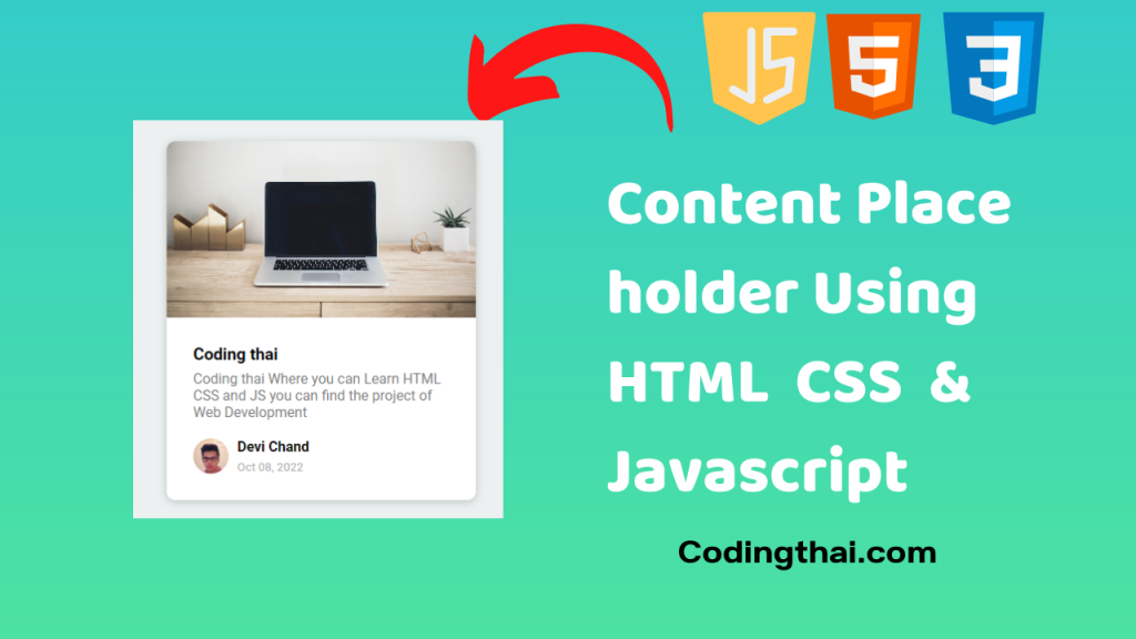
In this project, we have created a Profile. every website content creator has created their profile for the website. At first, we have to Create a div for the background Image, Description, and Profile section.
We have put the Image of the Laptop in the Top div section for the More Attractive profile. After that we have put our skills and project we have done before. At the last Div, we put the image icon Name of the User profile and Below the Name, we have to Put the Current date
Preview of Responsive Content Placeholder on Codepen
<!DOCTYPE html>
<html lang="en">
<head>
<meta charset="UTF-8" />
<meta name="viewport" content="width=device-width, initial-scale=1.0" />
<link rel="stylesheet" href="style.css" />
<title>Content Placeholder</title>
<style><pre class="EnlighterJSRAW" data-enlighter-language="css" data-enlighter-theme="" data-enlighter-highlight="" data-enlighter-linenumbers="" data-enlighter-lineoffset="" data-enlighter-title="" data-enlighter-group="">@import url('https://fonts.googleapis.com/css2?family=Roboto:wght@400;700&display=swap');
* {
box-sizing: border-box;
}
body {
background-color: #ecf0f1;
font-family: 'Roboto', sans-serif;
display: flex;
align-items: center;
justify-content: center;
height: 100vh;
overflow: hidden;
margin: 0;
}
img {
max-width: 100%;
}
.card {
box-shadow: 0 2px 10px rgba(0, 0, 0, 0.2);
border-radius: 10px;
overflow: hidden;
width: 350px;
}
.card-header {
height: 200px;
}
.card-header img {
object-fit: cover;
height: 100%;
width: 100%;
}
.card-content {
background-color: #fff;
padding: 30px;
}
.card-title {
height: 20px;
margin: 0;
}
.card-excerpt {
color: #777;
margin: 10px 0 20px;
}
.author {
display: flex;
}
.profile-img {
border-radius: 50%;
overflow: hidden;
height: 40px;
width: 40px;
}
.author-info {
display: flex;
flex-direction: column;
justify-content: space-around;
margin-left: 10px;
width: 100px;
}
.author-info small {
color: #aaa;
margin-top: 5px;
}
.animated-bg {
background-image: linear-gradient(
to right,
#f6f7f8 0%,
#edeef1 10%,
#f6f7f8 20%,
#f6f7f8 100%
);
background-size: 200% 100%;
animation: bgPos 1s linear infinite;
}
.animated-bg-text {
border-radius: 50px;
display: inline-block;
margin: 0;
height: 10px;
width: 100%;
}
@keyframes bgPos {
0% {
background-position: 50% 0;
}
100% {
background-position: -150% 0;
}
}</pre>
</style>
</head>
<body>
<div class="card">
<div class="card-header animated-bg" id="header"> </div>
<div class="card-content">
<h3 class="card-title animated-bg animated-bg-text" id="title">
</h3>
<p class="card-excerpt" id="excerpt">
<span class="animated-bg animated-bg-text"> </span>
<span class="animated-bg animated-bg-text"> </span>
<span class="animated-bg animated-bg-text"> </span>
</p>
<div class="author">
<div class="profile-img animated-bg" id="profile_img"> </div>
<div class="author-info">
<strong class="animated-bg animated-bg-text" id="name"
> </strong
>
<small class="animated-bg animated-bg-text" id="date"> </small>
</div>
</div>
</div>
</div>
<script>
const header = document.getElementById('header')
const title = document.getElementById('title')
const excerpt = document.getElementById('excerpt')
const profile_img = document.getElementById('profile_img')
const name = document.getElementById('name')
const date = document.getElementById('date')
const animated_bgs = document.querySelectorAll('.animated-bg')
const animated_bg_texts = document.querySelectorAll('.animated-bg-text')
setTimeout(getData, 2500)
function getData() {
header.innerHTML =
'<img src="https://images.unsplash.com/photo-1496181133206-80ce9b88a853?ixlib=rb-1.2.1&ixid=eyJhcHBfaWQiOjEyMDd9&auto=format&fit=crop&w=2102&q=80" alt="" />'
title.innerHTML = 'Coding thai '
excerpt.innerHTML =
'Coding thai Where you can Learn HTML CSS and JS you can find the project of Web Development '
profile_img.innerHTML =
'<img src="https://randomuser.me/api/portraits/men/45.jpg" alt="" />'
name.innerHTML = 'Devi Chand'
date.innerHTML = 'Oct 08, 2022'
animated_bgs.forEach((bg) => bg.classList.remove('animated-bg'))
animated_bg_texts.forEach((bg) => bg.classList.remove('animated-bg-text'))
}</script>
</body>
</html>You might like this
- Responsive Double Vertical Slider Using HTML CSS & JS
- Building an Auto Text Effect Using HTML CSS and JavaScript
- Creating A Password Generator Using Javascript
- Build A Keep Notes App Using HTML CSS & JS
- HoverBoard Effect Using HTML CSS & JS
- Responsive Mobile Tab Navigation Bar Using HTML CSS & JS
Responsive Content Placeholder Using HTML5 CSS3 & JavaScript [Source code]
For Creating a Responsive Content Placeholder Using HTML5 CSS3 & JavaScript. At first, you have to create three files (HTML, CSS, and JS) files with the named index.html, style.css, and Script.js in the same folder and you have to link the CSS and JS files to HTML. after that paste, the HTML code in index.html, and paste the CSS code in style.css at last paste the Javascript code in Script.js that’s all after pasting the code.
At first, you have to create an HTML file with the named index.html and paste the below HTML code on it and save it. Remember to give a .html extension to the HTML file.
<!DOCTYPE html>
<html lang="en">
  <head>
    <meta charset="UTF-8" />
    <meta name="viewport" content="width=device-width, initial-scale=1.0" />
    <link rel="stylesheet" href="style.css" />
    <title>Content Placeholder</title>
  </head>
  <body>
    <div class="card">
      <div class="card-header animated-bg" id="header"> </div>
      <div class="card-content">
        <h3 class="card-title animated-bg animated-bg-text" id="title">

        </h3>
        <p class="card-excerpt" id="excerpt">

          <span class="animated-bg animated-bg-text"> </span>
          <span class="animated-bg animated-bg-text"> </span>
          <span class="animated-bg animated-bg-text"> </span>
        </p>
        <div class="author">
          <div class="profile-img animated-bg" id="profile_img"> </div>
          <div class="author-info">
            <strong class="animated-bg animated-bg-text" id="name"
              > </strong
            >
            <small class="animated-bg animated-bg-text" id="date"> </small>
          </div>
        </div>
      </div>
    </div>
    <script src="script.js"></script>
  </body>
</html>
After pasting the HTML code, Now have to create a second CSS file with the named style.css. Paste the below code on it and save it. Again remember to give .css extension to CSS file.
<pre class="EnlighterJSRAW" data-enlighter-language="css" data-enlighter-theme="" data-enlighter-highlight="" data-enlighter-linenumbers="" data-enlighter-lineoffset="" data-enlighter-title="" data-enlighter-group="">@import url('https://fonts.googleapis.com/css2?family=Roboto:wght@400;700&display=swap');
* {
  box-sizing: border-box;
}
body {
  background-color: #ecf0f1;
  font-family: 'Roboto', sans-serif;
  display: flex;
  align-items: center;
  justify-content: center;
  height: 100vh;
  overflow: hidden;
  margin: 0;
}
img {
  max-width: 100%;
}
.card {
  box-shadow: 0 2px 10px rgba(0, 0, 0, 0.2);
  border-radius: 10px;
  overflow: hidden;
  width: 350px;
}
.card-header {
  height: 200px;
}
.card-header img {
  object-fit: cover;
  height: 100%;
  width: 100%;
}
.card-content {
  background-color: #fff;
  padding: 30px;
}
.card-title {
  height: 20px;
  margin: 0;
}
.card-excerpt {
  color: #777;
  margin: 10px 0 20px;
}
.author {
  display: flex;
}
.profile-img {
  border-radius: 50%;
  overflow: hidden;
  height: 40px;
  width: 40px;
}
.author-info {
  display: flex;
  flex-direction: column;
  justify-content: space-around;
  margin-left: 10px;
  width: 100px;
}
.author-info small {
  color: #aaa;
  margin-top: 5px;
}
.animated-bg {
  background-image: linear-gradient(
    to right,
    #f6f7f8 0%,
    #edeef1 10%,
    #f6f7f8 20%,
    #f6f7f8 100%
  );
  background-size: 200% 100%;
  animation: bgPos 1s linear infinite;
}
.animated-bg-text {
  border-radius: 50px;
  display: inline-block;
  margin: 0;
  height: 10px;
  width: 100%;
}
@keyframes bgPos {
  0% {
    background-position: 50% 0;
  }
  100% {
    background-position: -150% 0;
  }
}</pre>
At last, you have to create a Javascript file with the named script.js and paste the Js code on it and save it again don’t forget to give the .js extension to the Javascript file.
const header = document.getElementById('header')
const title = document.getElementById('title')
const excerpt = document.getElementById('excerpt')
const profile_img = document.getElementById('profile_img')
const name = document.getElementById('name')
const date = document.getElementById('date')
const animated_bgs = document.querySelectorAll('.animated-bg')
const animated_bg_texts = document.querySelectorAll('.animated-bg-text')
setTimeout(getData, 2500)
function getData() {
  header.innerHTML =
    '<img src="https://images.unsplash.com/photo-1496181133206-80ce9b88a853?ixlib=rb-1.2.1&ixid=eyJhcHBfaWQiOjEyMDd9&auto=format&fit=crop&w=2102&q=80" alt="" />'
  title.innerHTML = 'Coding thai '
  excerpt.innerHTML =
    'Coding thai Where you can Learn HTML CSS and JS you can find the project of Web Development '
  profile_img.innerHTML =
    '<img src="https://randomuser.me/api/portraits/men/45.jpg" alt="" />'
  name.innerHTML = 'Devi Chand'
  date.innerHTML = 'Oct 08, 2022'
  animated_bgs.forEach((bg) => bg.classList.remove('animated-bg'))
  animated_bg_texts.forEach((bg) => bg.classList.remove('animated-bg-text'))
}
That’s all after pasting the code now your code will be successfully run. If you get any kind of error/problem in the code just comment or contact me on social media