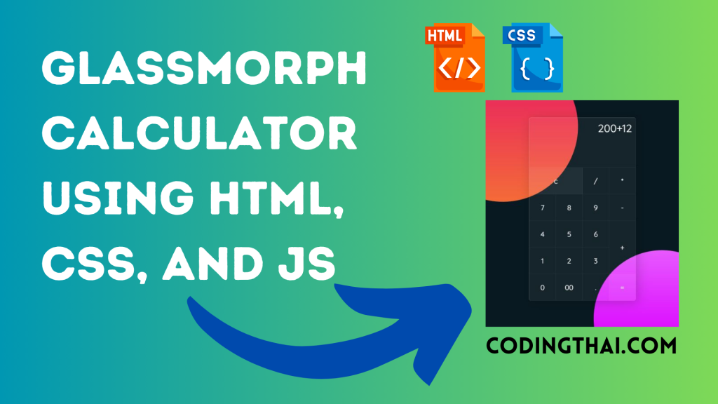
Hello, learner today In this blog post, We will be creating a Glassmorph Calculator using HTML, CSS, and JS. In the past post, we have created many projects one of them is the Glassmorphism loader Animation. Without wasting time Now it is time to Calculator.
As we know, a Calculator is a device that is used to calculate numerical numbers. There are various types of designs that we can find but the main motive of the calculator is calculation.
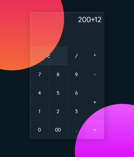
As you can see on the Avobe image of this Calculator [Glass Morphism Calculator], on the webpage. There is one calculator design in the glass morphism UI. All essential buttons are available there like addition, subtraction, multiplication, divide, and so on. Those different sizes of small boxes around that calculator make this glass morphism design of the calculator awesome.
At first, we have to create main div containers For the Calculator inside the main div container we have to use a span tag for numbers and signs. We have to use different span tags of different numbers and Signs That’s all in the HTML section.
In the CSS section, we style the Glassmorph Calculator using different CSS styling properties.
| Code By | Coding thai |
| Language Used | HTML And CSS |
| Responsive | Yes |
| External Link / Dependencies | Yes |
There are 3 types of styles to connect CSS with HTML files. Inline CSS, Internal CSS, External CSS. For Inline CSS in this, we have to write the CSS code inside the HTML code using style Attribute elements. For internal CSS we have to use the Style tag in the Head section on HTML File. We have used this Internal CSS in The below section. Last is External CSS for this we have to create another CSS File in the same folder this
Preview of Glassmorph Calculator Design
In this preview, we have used internal CSS in the code. In the internal CSS, we have to write the code in the head section using the Style tag. We have to write the code in <Style> CSS code </style> in the Head section in the HTML file. This code is run in Codepen.io
See the Pen Glassmorph JS Calculator Coding thai by Coding thai (@Codingthai) on CodePen.
You might like this
- Sneakers Product Card using HTML and CSS
- Snake Login Form using HTML, CSS, and JS
- Dynamic Stopwatch using HTML5, CSS3 and JS
- Square Navigation Bar using HTML5 and CSS3
- Liquid Loading Effect Using HTML5 And CSS
Glassmorph Calculator using HTML, CSS, and JS [Source code]
For Creating A Glassmorph Calculator using HTML, CSS, and JS. First, you have to create two files (HTML and CSS) files with the named index.html and style.css in the same folder and you have to link the CSS files to HTML. after that paste the below code, the HTML code in index.html, and paste the CSS code in style.css that’s all after pasting the code.
First, you have to create an HTML file with the named index.html paste the below HTML code on it, and save it. Remember to give a .html extension to the HTML file.
<!DOCTYPE html>
<html lang="en" >
<head>
  <meta charset="UTF-8">
  <title>CodePen - Glassmorph JS Calculator</title>
  <link rel="stylesheet" href="./style.css">

</head>
<body>
<!-- partial:index.partial.html -->
<div class="container">
  <form class="calculator" name="calc">
    <!--     <input type="text" readonly class="value" name="txt"> -->
    <textarea name="txt" readonly class="value" rows="3"></textarea>
    <span class="num clear" onclick="calc.txt.value = ''">c</span>
    <span class="num" onclick="document.calc.txt.value +='/'">/</span>
    <span class="num" onclick="document.calc.txt.value +='*'">*</span>
    <span class="num" onclick="document.calc.txt.value +='7'">7</span>
    <span class="num" onclick="document.calc.txt.value +='8'">8</span>
    <span class="num" onclick="document.calc.txt.value +='9'">9</span>
    <span class="num" onclick="document.calc.txt.value +='-'">-</span>
    <span class="num" onclick="document.calc.txt.value +='4'">4</span>
    <span class="num" onclick="document.calc.txt.value +='5'">5</span>
    <span class="num" onclick="document.calc.txt.value +='6'">6</span>
    <span class="num plus" onclick="document.calc.txt.value +='+'">+</span>
    <span class="num" onclick="document.calc.txt.value +='1'">1</span>
    <span class="num" onclick="document.calc.txt.value +='2'">2</span>
    <span class="num" onclick="document.calc.txt.value +='3'">3</span>
    <span class="num" onclick="document.calc.txt.value +='0'">0</span>
    <span class="num" onclick="document.calc.txt.value +='00'">00</span>
    <span class="num" onclick="document.calc.txt.value +='.'">.</span>
    <span class="num equal" onclick="document.calc.txt.value =eval(calc.txt.value)">=</span>
  </form>
</div>
<!-- partial -->
  <script src='https://cdnjs.cloudflare.com/ajax/libs/vanilla-tilt/1.7.0/vanilla-tilt.min.js'></script><script  src="./script.js"></script>

</body>
</html>
After pasting the HTML code, Now have to create a second CSS file with the named style.css. Paste the below code on it and save it. Again remember to give a .css extension to the CSS file.
@import url("https://fonts.googleapis.com/css2?family=Quicksand:wght@300;400;500&display=swap");
* {
  margin: 0;
  padding: 0;
  box-sizing: border-box;
  font-family: "Quicksand", sans-serif;
}

body {
  display: flex;
  justify-content: center;
  align-items: center;
  min-height: 100vh;
  background: #091921;
}
body::before {
  content: "";
  position: absolute;
  top: 0;
  left: 0;
  width: 100%;
  height: 100%;
  background: linear-gradient(#e91e63, #ffc107);
  clip-path: circle(22% at 30% 20%);
}
body::after {
  content: "";
  position: absolute;
  top: 0;
  left: 0;
  width: 100%;
  height: 100%;
  background: linear-gradient(#ffffff, #da00ff);
  clip-path: circle(20% at 70% 90%);
}
body .container {
  position: relative;
  background: rgba(255, 255, 255, 0.05);
  border-radius: 6px;
  overflow: hidden;
  z-index: 10;
  border-top: 1px solid rgba(255, 255, 255, 0.2);
  border-left: 1px solid rgba(255, 255, 255, 0.2);
  box-shadow: 5px 5px 30px rgba(0, 0, 0, 0.2);
}
body .container .calculator {
  position: relative;
  display: grid;
}
body .container .calculator .value {
  grid-column: span 4;
  height: 140px;
  width: 300px;
  text-align: right;
  border: none;
  outline: none;
  padding: 10px;
  font-size: 30px;
  background: transparent;
  color: #fff;
  border-bottom: 1px solid rgba(255, 255, 255, 0.05);
  border-right: 1px solid rgba(255, 255, 255, 0.05);
  resize: none;
}
body .container .calculator span {
  display: grid;
  place-items: center;
  width: 75px;
  height: 75px;
  color: #fff;
  font-weight: 400;
  cursor: pointer;
  font-size: 20px;
  user-select: none;
  border-bottom: 1px solid rgba(255, 255, 255, 0.05);
  border-right: 1px solid rgba(255, 255, 255, 0.05);
}
body .container .calculator span.clear {
  grid-column: span 2;
  width: 150px;
  background: rgba(255, 255, 255, 0.05);
}
body .container .calculator span.plus {
  grid-row: span 2;
  height: 150px;
}
body .container .calculator span.equal {
  background: rgba(255, 255, 255, 0.05);
}
body .container .calculator span:hover {
  transition: 0;
  background: rgba(255, 255, 255, 0.05);
}
body .container .calculator span:active {
  background: #14ff47;
  color: #192f00;
  font-size: 24px;
  font-weight: 500;
}
After pasting the HTML and CSS code, Now have to create a third Javascript file with the named script.js. Paste the below code on it and save it. Again remember to give a .js extension to the javascript file.
VanillaTilt.init(document.querySelector(".container"), {
  max: 15,
  speed: 400,
  glare: true,
  "max-glare": 0.2
});
That’s all after pasting the code your code will be successfully run. If you get any kind of error/problem in the code just comment or contact me on social media
Output Result
| Written By | @narendra-chand |
| Code By | Coding thai |