Hello, learner today In this blog post, We will be creating a Download Button Animation using HTML and CSS. In the past post, we have created many projects one of them is the Login Form. Without wasting time Now it is time to Download Button Animation.
Download buttons are essential For downloading anything to a user From Any website, allowing users to easily access and save content. There are different types of download Buttons But we have created animation Download buttons.
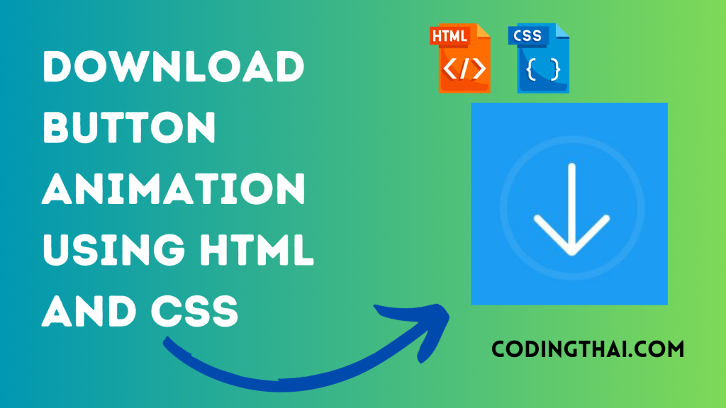
Let’s have a quick look at the given image of the project that we are going to create [Download Button Animation in HTML & CSS]. In the image, we can see the download Button. When we click on the download buttons it rotates from 90 degrees and rotates 180 degrees at last it shows the tick button when the download is completed.
At first, we have to create main div containers inside the container we have to create another div for row animation. Again inside the row div Create another div for Content and download Again create the div inside all div for the check box and rotate the animation. That’s all in the HTML section.
In the CSS section, we style and Animate the Download Button using different CSS styling properties. That’s all for more detail check out the Source code below
| Code By | Coding thai |
| Language Used | HTML And CSS |
| Responsive | Yes |
| External Link / Dependencies | No |
There are 3 types of styles to connect CSS with HTML files. Inline CSS, Internal CSS, External CSS. For Inline CSS in this, we have to write the CSS code inside the HTML code using style Attribute elements. For internal CSS we have to use the Style tag in the Head section on HTML File. We have used this Internal CSS in The below section. Last is External CSS for this we have to create another CSS File in the same folder.
Preview of Download Button Animation
In this preview, We have used the Codepen.io for Preview of the Source code. You can see how the code works from this preview.
See the Pen Download Animation – CSS Only Coding thai by Coding thai (@Codingthai) on CodePen.
You might like this
- Sneakers Product Card using HTML and CSS
- Snake Login Form using HTML, CSS, and JS
- Dynamic Stopwatch using HTML5, CSS3 and JS
- Square Navigation Bar using HTML5 and CSS3
- Liquid Loading Effect Using HTML5 And CSS
Download Button Animation using HTML and CSS [Source code]
For Creating A Download Button Animation using HTML and CSS. First, you have to create two files (HTML and CSS) files with the named index.html and style.css in the same folder and you have to link the CSS files to HTML. after that paste the below code, the HTML code in index.html, and paste the CSS code in style.css that’s all after pasting the code.
First, you have to create an HTML file with the named index.html paste the below HTML code on it, and save it. Remember to give a .html extension to the HTML file.
<!DOCTYPE html>
<html lang="en" >
<head>
  <meta charset="UTF-8">
  <title>CodePen - Download Animation - CSS Only</title>
  <link rel="stylesheet" href="https://cdnjs.cloudflare.com/ajax/libs/meyer-reset/2.0/reset.min.css">
<link rel='stylesheet' href='https://maxcdn.bootstrapcdn.com/bootstrap/3.3.6/css/bootstrap.min.css'><link rel="stylesheet" href="./style.css">

</head>
<body>
<!-- partial:index.partial.html -->
<div class="container-fluid">
	<div class="row">
		<div id="ms-container">
			<label for="ms-download">
				<div class="ms-content">
					<div class="ms-content-inside">
						<input type="checkbox" id="ms-download" />
						<div class="ms-line-down-container">
							<div class="ms-line-down"></div>
						</div>
						<div class="ms-line-point"></div>
					</div>
				</div>
			</label>
		</div>
	</div>
</div>
<!-- partial -->
  <script src='//cdnjs.cloudflare.com/ajax/libs/jquery/2.2.2/jquery.min.js'></script>
<script src='//maxcdn.bootstrapcdn.com/bootstrap/3.3.6/js/bootstrap.min.js'></script>
</body>
</html>
After pasting the HTML code, Now have to create a second CSS file with the named style.css. Paste the below code on it and save it. Again remember to give a .css extension to the CSS file.
body {
	width: 100%;
	height: 100%;
	margin: 0;
	padding: 0;
}

#ms-container {
	width: 100%;
	height: 100vh;
	background: #1c9cf2;
}

.ms-content {
	position: absolute;
	width: 200px;
	height: 200px;
	top: 0;
	left: 0;
	right: 0;
	bottom: 0;
	margin: auto;
	border: 10px solid #2ea4f2;
	border-radius: 100%;
}

.ms-content-inside {
	width: 100%;
	height: 100%;
	position: relative;
}

.ms-line-down-container {
	position: absolute;
	top: 0;
	left: 0;
	right: 0;
	bottom: 0;
	transform: rotate(0deg);
	transition: transform 0s ease;
}
#ms-download {
	display: none;
}
#ms-download:checked ~ .ms-line-down-container {
	transform: rotate(-360deg);
	transition: transform 1.5s ease 1.25s;
}

.ms-line-down {
	position: absolute;
	top: 0;
	right: 0;
	left: 0;
	bottom: 0;
	margin: auto;
	width: 10px;
	height: 125px;
	background: #FFFFFF;
	border-radius: 50px;
	transition: height .5s ease;
}

#ms-download:checked ~ .ms-line-down-container .ms-line-down {
	height: 10px;
	top: -20px;
	animation: ms-bounce .5s forwards .55s;
}
#ms-download:checked ~ .ms-line-down-container .ms-line-down:before {
	content: '';
	position: absolute;
	top: 0;
	left: -94px;
	right: 0;
	bottom: 0;
	width: 200px;
	height: 200px;
	border: 10px solid transparent;
	border-radius: 100%;
	animation: ms-border-fill .5s forwards 3s;
}

.ms-line-point {
	position: absolute;
	top: 0;
	left: 0;
	right: 0;
	bottom: 0;
	margin: auto;
	width: 58px;
	height: 130px;
	transition: height .15s ease .45s;
}

#ms-download:checked ~ .ms-line-point {
	height: 60px;
}

#ms-download:checked ~ .ms-line-point:before {
	transform: rotate(90deg);
	right: -10px;
	animation: ms-check-right .25s forwards 3s;
}

#ms-download:checked ~ .ms-line-point:after {
	transform: rotate(-90deg);
	left: -10px;
	animation: ms-check-left .25s forwards 3s;
}

.ms-line-point:before,
.ms-line-point:after {
	content: '';
	position: absolute;
	width: 10px;
	height: 75px;
	bottom: -10px;
	background: #FFFFFF;
	border-radius: 50px;
	transition: transform .15s ease .47s, left .15s ease .47s, right .15s ease .47s;
}

.ms-line-point:before {
	right: 0px;
	transform: rotate(45deg);
}

.ms-line-point:after {
	left: 0px;
	transform: rotate(-45deg);
}

@keyframes ms-bounce {
	0% {
		top: -20px;
	}
	25% {
		top: -250px;
	}
	50% {
		top: -275px;
	}
	100% {
		top: -190px;
	}
}

@keyframes ms-check-left {
	0% {
		transform: rotate(-90deg);
		left: -10px;
		height: 75px;
	}
	100% {
		transform: rotate(-45deg);
		left: 0px;
		height: 45px;
	}
}

@keyframes ms-check-right {
	0% {
		transform: rotate(90deg);
		right: -10px;
		height: 75px;
		bottom: -10px;
	}
	100% {
		transform: rotate(45deg);
		right: 10px;
		height: 80px;
		bottom: -15px;
	}
}

@keyframes ms-border-fill {
	0% {
		border: 10px solid transparent;
	}
	100% {
		border: 10px solid #FFFFFF;
	}
}
That’s all after pasting the code your code will be successfully run. If you get any kind of error/problem in the code just comment or contact me on social media
Output Result

Conclusion
After creating this Download Button Animation you will able to know how to create a Download Button easily. From this project, you will learn about different properties of CSS.
| Written By | @narendra-chand |
| Code By | Coding thai |