Hello, learner. Today, we will create a Glowing Neon Social Media Button in this blog post. We have created many projects in the past post, including a Budget App Javascript. It is time to create a Social Media Button without wasting time.
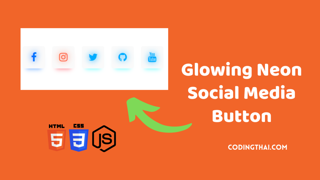
A glowing neon social media button is a visually striking digital icon resembling a neon sign. It features vibrant colors, stylized social media logos, subtle animations, and interactive hover effects. Clicking on the button redirects users to social media profiles or allows content sharing.
If you’re having difficulty understanding what I’m saying or what this Glowing Neon Social Media Button is, you can ask me in the comment.
| Code By | Coding thai |
| Language Used | HTML, CSS and JS |
| Responsive | Yes |
| External Link / Dependencies | No |
There are three types of styles to connect CSS with HTML files: inline CSS, Internal CSS, and External CSS. For Inline CSS, we have to write the CSS code inside the HTML code using style Attribute elements. For internal CSS, we have to use the Style tag in the Head section of the HTML File. We have used this internal CSS in the section below. Last is External CSS. We have to create another CSS File in the same folder for this.
Preview of Social Media Button
In this preview, we have used internal CSS in the code. We must write the code in the head section using the Style tag in the internal CSS. We must write the code in <Style> CSS code </style> in the Head sectHTML and CSS Projection in the HTML file. This code is run in Codepen.io
See the Pen Glowing Neon Social Media Icons by Coding thai (@Codingthai) on CodePen.
You might like this
Social Media Button [Source code]
For Creating A Budget App using HTML, CSS, and JS, first, you must create three files (HTML, CSS, and JS) named index.html, style.css, and Script.js in the same folder and link the CSS and JS files to HTML. After that, paste the below code: the HTML code in index.html and the CSS code in style.css.That’s all after pasting the code.
First, you must create an HTML file named index.html, paste the below HTML code, and save it. Remember to give a .html extension to the HTML file.
<!doctype html>
<html>
<head>
<title>Social Media Icons Neon Glow Effect</title>
</head>
<link rel="stylesheet" type="text/css" href="style.css">
<link rel="stylesheet" href="https://stackpath.bootstrapcdn.com/font-awesome/4.7.0/css/font-awesome.min.css">
<body>
<div class="container">
<div class="btn fb-btn">
<i class="fa fa-facebook" aria-hidden="true" id="fb"></i>
</div>
<div class="btn ig-btn">
<i class="fa fa-instagram" aria-hidden="true" id="ig"></i>
</div>
<div class="btn tw-btn">
<i class="fa fa-twitter" aria-hidden="true" id="tw"></i>
</div>
<div class="btn tw-btn">
<i class="fa fa-github" aria-hidden="true" id="tw"></i>
</div>
<div class="btn tw-btn">
<i class="fa fa-youtube" aria-hidden="true" id="tw"></i>
</div>
</div>
</body>
</html>
After pasting the HTML code, you need to create a second CSS file named style.css. Paste the code below on it and save it. Again, remember to give the CSS file a .css extension.
html,body
{
margin: 0;
padding: 0;
align-items: center;
justify-content: center;
height: 100%;
background: #fff;
}
.container
{
display: flex;
justify-content: center;
align-items: center;
height: 100%;
}
.btn
{
width: 100px;
height: 100px;
background-color: #fafafa;
display: flex;
align-items: center;
justify-content: center;
margin-left: 1em;
margin-right: 1em;
cursor: pointer;
transition: all 0.3s;
border-radius: 10px;
}
i.fa
{
font-size: 44px;
}
#fb
{
color: #006fff;
text-shadow: 0 0 30px #006fff;
}
#ig
{
color: #ff5f40;
text-shadow: 0 0 30px #ff5f40;
}
#tw
{
color: #00acff;
text-shadow: 0 0 30px #00acff;
}
.btn.fb-btn
{
box-shadow: 0 20px 20px -17px rgba(0,111,255,0.53);
}
.btn.fb-btn:hover
{
transform: scale(1.2);
box-shadow: 0 30px 45px -15px rgba(0,111,255,0.65);
}
.btn.ig-btn
{
box-shadow: 0 20px 20px -17px rgba(255,16,39,0.5);
}
.btn.ig-btn:hover
{
transform: scale(1.2);
box-shadow: 0 30px 45px -15px rgba(255,16,39,0.57);
}
.btn.tw-btn
{
box-shadow: 0 20px 20px -17px rgba(0,255,255,0.53);
}
.btn.tw-btn:hover
{
transform: scale(1.2);
box-shadow: 0 30px 45px -15px rgba(0,111,255,0.6);
}
That’s all. After pasting the code, your code will be successfully run. If you get any error/problem in the code, just comment or contact me on social media
Output Result

| Written By | @codingthai |
| Code By | @Codewithmaya |
| Code idea | @Codewithmaya |