Hey, learner today In this article, We will be Creating an Animated Navigation Bar Using HTML CSS & Javascript. In the past post, we have created many projects one of them Responsive FAQ Collapse using HTML, CSS, and JS. Now it is time to create an Animated Navigation Bar.
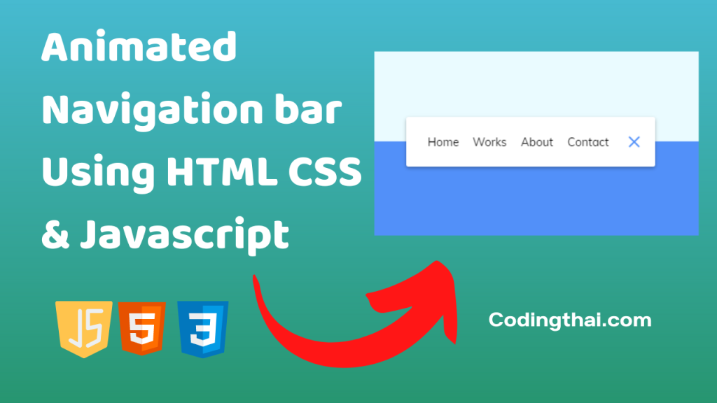
Almost every website contains a navigation bar. By using a navigation bar, users can easily navigate to the other pages of the website and if the navigation bar is animated it looks attractive and catches the attention of the viewer. In this article, we are going to see the basic code for creating an Animated navigation bar by using HTML, CSS and JS
In the HTML section first Create a nav section inside the nav section create an unordered list <ul> and write the menu list using <li> tag again inside the nav section and create a button. at last link is the javascript file in the last which is all in the HTML section
Now in CSS, Style the HTML code with CSS properties like color, margin, padding, position, border, height, transform, etc.
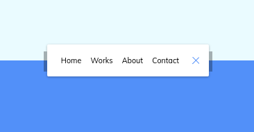
Preview of Animated Navigation Bar
In this preview, we have used internal CSS in the code. In the internal CSS, we have to write the code in the head section using the Style tag. We have to write the code in <Style> CSS code </style> in the Head section in the HTML file. This code is run in Codepen.io
See the Pen
Animated Navigation Bar Using HTML CSS & Javascript by Coding thai (@Codingthai)
on CodePen.
You might like this
- Dynamic Stopwatch using HTML, CSS and JS
- Rotating Navigation using HTML, CSS, and JS
- Progress Steps Bar using HTML, CSS, and JS
- Hidden Search Bar using HTML, CSS, and JS
- Fixed expanding card transitions Using HTML, CSS, and JS
Animated Navigation bar Using HTML CSS & Javascript [Source code]
To create an Animated Navigation bar Using HTML CSS & Javascript you have to create three files (HTML, CSS, and JS) files with the named index.html, style.css, and Script.js in the same folder and you have to link the CSS and JS files to HTML. after that paste, the HTML code in index.html, and paste the CSS code in style.css at last paste the Javascript code in Script.js that’s all after pasting the code.
At first, you have to create an HTML file with the named index.html and paste the below HTML code on it and save it. Remember to give a .html extension to the HTML file.
<!DOCTYPE html>
<!--Codingthai.com-->
<html lang="en">
  <head>
    <meta charset="UTF-8" />
    <meta name="viewport" content="width=device-width, initial-scale=1.0" />
    <link rel="stylesheet" href="style.css" />
    <title>Animated Navigation</title>
  </head>
  <body>
    <nav class="active" id="nav">
      <ul>
        <li><a href="#">Home</a></li>
        <li><a href="#">Works</a></li>
        <li><a href="#">About</a></li>
        <li><a href="#">Contact</a></li>
      </ul>
      <button class="icon" id="toggle">
        <div class="line line1"></div>
        <div class="line line2"></div>
      </button>
    </nav>
    <script src="script.js"></script>
    <!-- Dribbble link: https://dribbble.com/shots/2427219-Header-Navigation-Day-053-dailyui -->
  </body>
</html>
After pasting the HTML code, Now have to create a second CSS file with the named style.css. Paste the below code on it and save it. Again remember to give .css extension to CSS file.
@import url('https://fonts.googleapis.com/css?family=Muli&display=swap');
* {
  box-sizing: border-box;
}
body {
  background-color: #eafbff;
  background-image: linear-gradient(
    to bottom,
    #eafbff 0%,
    #eafbff 50%,
    #5290f9 50%,
    #5290f9 100%
  );
  font-family: 'Muli', sans-serif;
  display: flex;
  align-items: center;
  justify-content: center;
  height: 100vh;
  margin: 0;
}
nav {
  background-color: #fff;
  padding: 20px;
  width: 80px;
  display: flex;
  align-items: center;
  justify-content: center;
  border-radius: 3px;
  box-shadow: 0 2px 5px rgba(0, 0, 0, 0.3);
  transition: width 0.6s linear;
  overflow-x: hidden;
}
nav.active {
  width: 350px;
}
nav ul {
  display: flex;
  list-style-type: none;
  padding: 0;
  margin: 0;
  width: 0;
  transition: width 0.6s linear;
}
nav.active ul {
  width: 100%;
}
nav ul li {
  transform: rotateY(0deg);
  opacity: 0;
  transition: transform 0.6s linear, opacity 0.6s linear;
}
nav.active ul li {
  opacity: 1;
  transform: rotateY(360deg);
}
nav ul a {
  position: relative;
  color: #000;
  text-decoration: none;
  margin: 0 10px;
}
.icon {
  background-color: #fff;
  border: 0;
  cursor: pointer;
  padding: 0;
  position: relative;
  height: 30px;
  width: 30px;
}
.icon:focus {
  outline: 0;
}
.icon .line {
  background-color: #5290f9;
  height: 2px;
  width: 20px;
  position: absolute;
  top: 10px;
  left: 5px;
  transition: transform 0.6s linear;
}
.icon .line2 {
  top: auto;
  bottom: 10px;
}
nav.active .icon .line1 {
  transform: rotate(-765deg) translateY(5.5px);
}
nav.active .icon .line2 {
  transform: rotate(765deg) translateY(-5.5px);
}
At last, you have to create a Javascript file with the named script.js and paste the Js code on it and save it again don’t forget to give the .js extension to the Javascript file.
const toggle = document.getElementById('toggle')
const nav = document.getElementById('nav')
toggle.addEventListener('click', () => nav.classList.toggle('active'))
That’s all after pasting the code now your code will be successfully run. If you get any kind of error/problem in the code just comment down or contact me
Output
1 thought on “Animated Navigation Bar Using HTML CSS & Javascript”