Hello, learner today In this blog post, We will be creating Wacy Hover button Using HTML5 & CSS3. In the past post, we have created many projects one of them is Creating Tic Tac Toe using Javascript. With Out wasting time Now it is time to create a Wacy Hover Button. This code is written by Coding.stella
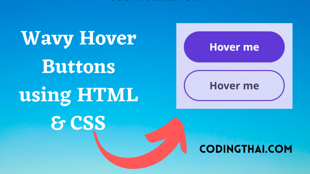
In this project, A website having a hover button looks awesome and attractive to the user. This hover button is unique to other buttons. There is not so much HTML code There are two Classes with the class name “btn” and “btn outlined” with the text Hover me that all in the HTML code the design and another color lover liquid effect is done by using CSS
This Button has an awsome effect while you click in the button or move the pointer to the button has a wave effect on it is done by using CSS. We have used different types of tags to customize the code like before hover after hover and many more
| Language Used | HTML And CSS |
| External Link / Dependencies | No |
| Responsive | Yes |
There are 3 types of styles to connect CSS with HTML files. Inline CSS, Internal CSS, External CSS. For Inline CSS in this, we have to write the CSS code inside the HTML code using style Attribute elements. For internal CSS we have to use the Style tag in the Head section on HTML File. we Have used this Internal CSS in The below section. Last is External CSS for this we have to create another CSS File in the same folder this
Preview of Wacy Hover button
In this preview, we have used internal CSS in the code. In the internal CSS, we have to write the code in the head section using the Style tag. We have to write the code in <Style> CSS code </style> in the Head section in the HTML file. You can Copy and Run the preview in the Top left of the code
<!DOCTYPE html>
<html lang="en" >
<head>
  <meta charset="UTF-8">
  <title>CodePen - Wavy</title>
  <link rel="stylesheet" href="https://cdnjs.cloudflare.com/ajax/libs/meyer-reset/2.0/reset.min.css">
<link rel="stylesheet" href="./style.css">
<script src="https://cdnjs.cloudflare.com/ajax/libs/prefixfree/1.0.7/prefixfree.min.js"></script>
<style>
  @import url("https://fonts.googleapis.com/css2?family=Noto+Sans:wght@700&display=swap");
.bg-video {
  content: "";
  position: absolute;
  width: 100%;
  height: auto;
  min-height: 100%;
  display: flex;
  align-items: center;
  justify-content: center;
}
.bg-video:before {
  content: "";
  width: 100%;
  padding-bottom: 56.25%;
  display: block;
  height: 0;
}
.bg-video iframe {
  position: absolute;
  top: 50%;
  left: 50%;
  width: 1000%;
  height: 135%;
  transform: translate3d(-50%, -50%, 0);
}

body {
  display: flex;
  align-items: center;
  justify-content: center;
  flex-direction: column;
  gap: 1.5em;
  overflow: hidden;
  width: 100vw;
  height: 100vh;
  font-size: max(3.333vmin, 16px);
  font-family: "Noto Sans", sans-serif;
  -webkit-font-smoothing: antialiased;
  -moz-osx-font-smoothing: grayscale;
}
body:before {
  content: "";
  position: absolute;
  inset: 0;
  background: linear-gradient(20deg, #3844d8 40%, #385fd8);
  opacity: 0.2;
}

.btn {
  overflow: hidden;
  position: relative;
  z-index: 0;
  text-decoration: none;
  color: white;
  display: inline-flex;
  align-items: center;
  justify-content: center;
  flex-wrap: wrap;
  font-size: 2em;
  min-width: 13ch;
  padding: 1em 1.15em;
  border-radius: 2em;
  transition: opacity 0.3s cubic-bezier(0.2, 0, 0.1, 1), transform 0.3s cubic-bezier(0.2, 0, 0.1, 1), box-shadow 0.5s ease, color 0.5s ease, background 0.5s ease;
  will-change: box-shadow, color, transform, opacity, background;
  background: #6138D8;
  box-shadow: inset 0 0 0 0.1em #6138D8, 0 0 0 rgba(124, 56, 216, 0);
}
.btn.outlined {
  display: inline-flex;
  background: none;
  color: #170b39;
}
.btn:after, .btn:before {
  content: "";
  position: absolute;
  z-index: -1;
  pointer-events: none;
  top: 0;
  right: -50%;
  left: -50%;
  height: 0;
  padding-bottom: 200%;
  border-radius: 39%;
  border: unset;
  transition: transform 0s cubic-bezier(0.2, 0, 0.1, 1) 0.5s, opacity 0.5s cubic-bezier(0.2, 0, 0.1, 1);
  opacity: 0;
}
.btn:before {
  transform: translate3d(-10%, 4.8em, 0) rotate(330deg);
  background: linear-gradient(25deg, #9638d8, rgba(150, 56, 216, 0));
}
.btn:after {
  transform: translate3d(10%, 4.8em, 0) rotate(0deg);
  background: linear-gradient(70deg, rgba(150, 56, 216, 0.5), rgba(124, 56, 216, 0));
}
.btn:hover, .btn:focus {
  transition: opacity 0.3s cubic-bezier(0.2, 0, 0.1, 1), transform 0.3s cubic-bezier(0.2, 0, 0.1, 1), box-shadow 2s ease, color 1.5s ease, background 1s ease 0.75s;
  background: #9638d8;
  box-shadow: inset 0 0 0 0.1em #6138D8, 0 0 1.75em rgba(150, 56, 216, 0.5);
}
.btn:hover.outlined, .btn:focus.outlined {
  color: white;
}
.btn:hover:before, .btn:hover:after, .btn:focus:before, .btn:focus:after {
  transition: transform 2s ease 0s, opacity 0.2s ease;
  opacity: 1;
}
.btn:hover:before, .btn:focus:before {
  transform: translate3d(-10%, -1em, 0) rotate(100deg);
}
.btn:hover:after, .btn:focus:after {
  transform: translate3d(10%, -1em, 0) rotate(180deg);
}
  </style>
</head>
<body>
<!-- partial:index.partial.html -->
<a class="btn" href="#0">Hover me</a><a class="btn outlined" href="#0">Hover me</a>
<!-- partial -->

</body>
</html>
You might like this
- Coder Animation Using HTML5 & CSS3
- SVG Text Animation Using HTML5 & CSS3
- Content Placeholder Using HTML5 CSS3 & JavaScript
- Responsive Sticky Navbar Using HTML5 CSS3 & JavaScript
Wacy Hover buttons using HTML5 and CSS3 [Source code]
For Creating a Wacy Hover buttons using HTML5 and CSS3. First, you have to create three files (HTML and CSS) files with the named index.html and style.css in the same folder and you have to link the CSS files to HTML. after that paste, the HTML code in index.html, and lastly paste the CSS code in style.css that’s all after pasting the code.
First, you have to create an HTML file with the named index.html and paste the below HTML code on it and save it. Remember to give a .html extension to the HTML file.
<!DOCTYPE html>
<html lang="en" >
<head>
  <meta charset="UTF-8">
  <title>CodePen - Wavy</title>
  <link rel="stylesheet" href="https://cdnjs.cloudflare.com/ajax/libs/meyer-reset/2.0/reset.min.css">
<link rel="stylesheet" href="./style.css">
<script src="https://cdnjs.cloudflare.com/ajax/libs/prefixfree/1.0.7/prefixfree.min.js"></script>

</head>
<body>
<!-- partial:index.partial.html -->
<a class="btn" href="#0">Hover me</a><a class="btn outlined" href="#0">Hover me</a>
<!-- partial -->

</body>
</html>
After pasting the HTML code, Now have to create a second CSS file with the named style.css. Paste the below code on it and save it. Again remember to give a .css extension to the CSS file.
@import url("https://fonts.googleapis.com/css2?family=Noto+Sans:wght@700&display=swap");
.bg-video {
  content: "";
  position: absolute;
  width: 100%;
  height: auto;
  min-height: 100%;
  display: flex;
  align-items: center;
  justify-content: center;
}
.bg-video:before {
  content: "";
  width: 100%;
  padding-bottom: 56.25%;
  display: block;
  height: 0;
}
.bg-video iframe {
  position: absolute;
  top: 50%;
  left: 50%;
  width: 1000%;
  height: 135%;
  transform: translate3d(-50%, -50%, 0);
}

body {
  display: flex;
  align-items: center;
  justify-content: center;
  flex-direction: column;
  gap: 1.5em;
  overflow: hidden;
  width: 100vw;
  height: 100vh;
  font-size: max(3.333vmin, 16px);
  font-family: "Noto Sans", sans-serif;
  -webkit-font-smoothing: antialiased;
  -moz-osx-font-smoothing: grayscale;
}
body:before {
  content: "";
  position: absolute;
  inset: 0;
  background: linear-gradient(20deg, #3844d8 40%, #385fd8);
  opacity: 0.2;
}

.btn {
  overflow: hidden;
  position: relative;
  z-index: 0;
  text-decoration: none;
  color: white;
  display: inline-flex;
  align-items: center;
  justify-content: center;
  flex-wrap: wrap;
  font-size: 2em;
  min-width: 13ch;
  padding: 1em 1.15em;
  border-radius: 2em;
  transition: opacity 0.3s cubic-bezier(0.2, 0, 0.1, 1), transform 0.3s cubic-bezier(0.2, 0, 0.1, 1), box-shadow 0.5s ease, color 0.5s ease, background 0.5s ease;
  will-change: box-shadow, color, transform, opacity, background;
  background: #6138D8;
  box-shadow: inset 0 0 0 0.1em #6138D8, 0 0 0 rgba(124, 56, 216, 0);
}
.btn.outlined {
  display: inline-flex;
  background: none;
  color: #170b39;
}
.btn:after, .btn:before {
  content: "";
  position: absolute;
  z-index: -1;
  pointer-events: none;
  top: 0;
  right: -50%;
  left: -50%;
  height: 0;
  padding-bottom: 200%;
  border-radius: 39%;
  border: unset;
  transition: transform 0s cubic-bezier(0.2, 0, 0.1, 1) 0.5s, opacity 0.5s cubic-bezier(0.2, 0, 0.1, 1);
  opacity: 0;
}
.btn:before {
  transform: translate3d(-10%, 4.8em, 0) rotate(330deg);
  background: linear-gradient(25deg, #9638d8, rgba(150, 56, 216, 0));
}
.btn:after {
  transform: translate3d(10%, 4.8em, 0) rotate(0deg);
  background: linear-gradient(70deg, rgba(150, 56, 216, 0.5), rgba(124, 56, 216, 0));
}
.btn:hover, .btn:focus {
  transition: opacity 0.3s cubic-bezier(0.2, 0, 0.1, 1), transform 0.3s cubic-bezier(0.2, 0, 0.1, 1), box-shadow 2s ease, color 1.5s ease, background 1s ease 0.75s;
  background: #9638d8;
  box-shadow: inset 0 0 0 0.1em #6138D8, 0 0 1.75em rgba(150, 56, 216, 0.5);
}
.btn:hover.outlined, .btn:focus.outlined {
  color: white;
}
.btn:hover:before, .btn:hover:after, .btn:focus:before, .btn:focus:after {
  transition: transform 2s ease 0s, opacity 0.2s ease;
  opacity: 1;
}
.btn:hover:before, .btn:focus:before {
  transform: translate3d(-10%, -1em, 0) rotate(100deg);
}
.btn:hover:after, .btn:focus:after {
  transform: translate3d(10%, -1em, 0) rotate(180deg);
}
That’s all after pasting the code now your code will be successfully run. If you get any kind of error/problem in the code just comment or contact me on social media
Output Result
| Written By | @codingthai |
| Code By | @Coding.stella |