Hello, learner In this article, we are going to Vintage Images Using CSS. In the past post, we have created a Pricing Card design using HTML and SCSS. Now it is time to create Vintage Images Using CSS.
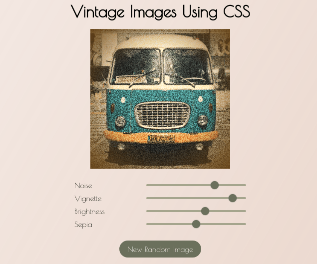
In this small project, we have used HTML, CSS, and javascript. As you see in the above image this is the output of our small project. We have taken images from this link we have to create a NOISE, VIGNETTE, BRIGHTNESS, and SEPIA element to increase or decrease the photo quality and At the bottom, there is a button Named New Random Image This button bring the random image from this link
Vintage Images Using CSS [Source code]
To create a Vintage Images Using CSS you have to create three files named index.html, style.css, and Script.js in the same folder and you have to link the CSS file and Javascript file to HTML. after that paste the HTML code in index.html and paste the SCSS code in style.css that’s all after pasting the code.
At first, you have to create an HTML file named index.html and paste the below code on it and save it. Remember to give a .html extension to the HTML file.
After pasting the HTML code the second you have to create a CSS file named style.CSS. Paste the below code on it and save it. Again remember to give .css extension to CSS file.
@import url(“https://fonts.googleapis.com/css2?family=Poiret+One&display=swap”);
* {
margin: 0;
padding: 0;
font-family: “Poiret One”, serif;
}
body {
display: flex;
justify-content: center;
align-items: center;
height: 100vh;
background-image: linear-gradient(120deg, #cb997e33, #cb997e66);
}
#content {
display: flex;
flex-direction: column;
justify-content: center;
align-items: center;
transition: opacity 0.5s;
}
h1 {
font-size: 2.5rem;
margin-bottom: 20px;
}
#imgContainer {
position: relative;
width: 350px;
height: 350px;
}
#imgContainer > * {
height: 100%;
width: 100%;
}
#imgVignette {
position: absolute;
top: 0;
left: 0;
background-image: radial-gradient(#ffffff00, #ffffff00, #66400f);
z-index: 4;
opacity: 0.9;
}
#imgContainer > img {
object-fit: cover;
}
#imgNoise {
opacity: 0.7;
mix-blend-mode: overlay;
position: absolute;
top: 0;
left: 0;
z-index: 3;
}
#imgBrightness,
#imgSepia {
z-index: 2;
position: absolute;
top: 0;
left: 0;
}
#imgSepia {
backdrop-filter: sepia(50%);
}
#imgBrighness {
backdrop-filter: brightness(120%);
}
#controls {
width: 100%;
margin: 20px 0;
}
.range-input {
display: flex;
justify-content: space-between;
margin: 10px;
font-size: 1.2rem;
align-items: center;
}
input[type=”range”] {
-webkit-appearance: none;
width: 250px;
height: 5px;
background-color: #a5a58d;
border-radius: 5px;
}
input[type=”range”]::-webkit-slider-thumb {
-webkit-appearance: none;
height: 20px;
width: 20px;
border-radius: 50%;
background: #6b705c;
cursor: ew-resize;
box-shadow: 0 0 2px 0 #555;
transition: background 0.3s ease-in-out;
}
input[type=”range”]::-webkit-slider-runnable-track {
-webkit-appearance: none;
box-shadow: none;
border: none;
background: transparent;
}
button {
padding: 10px 20px;
font-size: 1.2rem;
border-radius: 50rem;
border: none;
background-color: #6b705c;
color: #fff;
cursor: pointer;
transition: background-color 0.3s;
}
button:hover {
background-color: #3a3d32;
}
#loader {
position: absolute;
top: 50%;
left: 50%;
transform: translate(-50%, -50%);
height: 250px;
width: 250px;
opacity: 0;
pointer-events: none;
transition: opacity 0.5s;
}
.orbit {
border: 3px solid #3b3b3b;
border-radius: 50%;
position: absolute;
animation: orbit linear 4s infinite;
}
.orbit:nth-of-type(1) {
height: 250px;
width: 250px;
}
.orbit:nth-of-type(2) {
height: 175px;
width: 175px;
left: 15%;
top: 15%;
animation: orbit linear 3s infinite;
}
.orbit:nth-of-type(3) {
height: 125px;
width: 125px;
left: 25%;
top: 25%;
animation: orbit linear 2s infinite;
}
#main_circle {
position: absolute;
top: 35%;
left: 35%;
height: 75px;
width: 75px;
border-radius: 50%;
background-color: #aa8104;
}
.orbit::after {
content: “”;
width: 15px;
height: 15px;
background-color: #0f4b00;
position: absolute;
top: 65px;
left: -10px;
border-radius: 50%;
}
.orbit:nth-of-type(1)::after {
top: 70px;
left: 0;
background-color: #00364b;
}
.orbit:nth-of-type(3)::after {
top: 70px;
left: -5px;
background-color: #4b3300;
}
@keyframes orbit {
to {
transform: rotate(360deg);
}
}
After creating and pasting the HTML and CSS code now you have to paste Javascript code in file script.js and save it again remember to give .js extension to the javascript file.
That’s all after after pasting the code now your code will successfully run. If you get any kind of error/problem in the code just comment down or contact me on social media
You might like this
- Responsive dropdown menu using HTML & CSS
- Music player widget using HTML, CSS & JS
- Social Media Icons with Popups HTML & Pure CSS Only