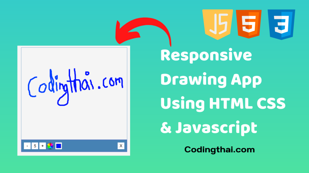
Hey, learner today In this blog post, We will be Creating a Responsive Drawing App Using HTML CSS & Javascript. In the past post, we have created many projects one of them Theme Clock Digital & Analog Using HTML CSS & Javascript. Now it is time to create a Responsive Drawing App.

In this project, we have created a Drawing pad. We can Increase the line size of the form below the Plus button and You can choose a different color with the color section in the drawing pad.
Preview of Responsive Drawing App on Codepen
You might like this
- Responsive Background Slider Using HTML CSS & Javascript
- Daily Drink Water Goal Project Using HTML CSS & Javascript
- Animated Navigation Bar Using HTML CSS & Javascript
- Responsive FAQ Collapse using HTML, CSS, and JS
- Dad Jokes Project using HTML, CSS, and JS
- Responsive Login Form using HTML and CSS 3
Responsive Drawing App Using HTML CSS & Javascript [Source code]
To create a Responsive Drawing App Using HTML CSS & Javascript At first, you have to create three files (HTML, CSS, and JS) files with the named index.html, style.css, and Script.js in the same folder and you have to link the CSS and JS files to HTML. after that paste, the HTML code in index.html, and paste the CSS code in style.css at last paste the Javascript code in Script.js that’s all after pasting the code.
At first, you have to create an HTML file with the named index.html and paste the below HTML code on it and save it. Remember to give a .html extension to the HTML file.
<!DOCTYPE html>
<!--Codingthai.com-->
<html lang="en">
  <head>
    <meta charset="UTF-8" />
    <meta name="viewport" content="width=device-width, initial-scale=1.0" />
    <link
      rel="stylesheet"
      href="https://cdnjs.cloudflare.com/ajax/libs/font-awesome/5.14.0/css/all.min.css"
      integrity="sha512-1PKOgIY59xJ8Co8+NE6FZ+LOAZKjy+KY8iq0G4B3CyeY6wYHN3yt9PW0XpSriVlkMXe40PTKnXrLnZ9+fkDaog=="
      crossorigin="anonymous"
    />
    <link rel="stylesheet" href="style.css" />
    <title>Background Slider</title>
  </head>
  <body>
    <div class="slider-container">
      <div
        class="slide active"
        style="
          background-image: url('https://images.unsplash.com/photo-1549880338-65ddcdfd017b?ixlib=rb-1.2.1&ixid=eyJhcHBfaWQiOjEyMDd9&auto=format&fit=crop&w=2100&q=80');
        "
      ></div>
      <div
        class="slide"
        style="
          background-image: url('https://images.unsplash.com/photo-1511593358241-7eea1f3c84e5?ixlib=rb-1.2.1&ixid=eyJhcHBfaWQiOjEyMDd9&auto=format&fit=crop&w=1934&q=80');
        "
      ></div>

      <div
        class="slide"
        style="
          background-image: url('https://images.unsplash.com/photo-1495467033336-2effd8753d51?ixlib=rb-1.2.1&ixid=eyJhcHBfaWQiOjEyMDd9&auto=format&fit=crop&w=2100&q=80');
        "
      ></div>

      <div
        class="slide"
        style="
          background-image: url('https://images.unsplash.com/photo-1522735338363-cc7313be0ae0?ixlib=rb-1.2.1&ixid=eyJhcHBfaWQiOjEyMDd9&auto=format&fit=crop&w=2689&q=80');
        "
      ></div>

      <div
        class="slide"
        style="
          background-image: url('https://images.unsplash.com/photo-1559087867-ce4c91325525?ixlib=rb-1.2.1&ixid=eyJhcHBfaWQiOjEyMDd9&auto=format&fit=crop&w=2100&q=80');
        "
      ></div>

      <button class="arrow left-arrow" id="left">
        <i class="fas fa-arrow-left"></i>
      </button>

      <button class="arrow right-arrow" id="right">
        <i class="fas fa-arrow-right"></i>
      </button>
    </div>
    <script src="script.js"></script>
  </body>
</html>
After pasting the HTML code, Now have to create a second CSS file with the named style.css. Paste the below code on it and save it. Again remember to give .css extension to CSS file.
@import url('https://fonts.googleapis.com/css2?family=Roboto:wght@400;700&display=swap');

* {
  box-sizing: border-box;
}

body {
  font-family: 'Roboto', sans-serif;
  display: flex;
  flex-direction: column;
  align-items: center;
  justify-content: center;
  height: 100vh;
  overflow: hidden;
  margin: 0;
  background-position: center center;
  background-size: cover;
  transition: 0.4s;
}

body::before {
  content: '';
  position: absolute;
  top: 0;
  left: 0;
  width: 100%;
  height: 100vh;
  background-color: rgba(0, 0, 0, 0.7);
  z-index: -1;
}

.slider-container {
  box-shadow: 0 3px 6px rgba(0, 0, 0, 0.16), 0 3px 6px rgba(0, 0, 0, 0.23);
  height: 70vh;
  width: 70vw;
  position: relative;
  overflow: hidden;
}

.slide {
  opacity: 0;
  height: 100vh;
  width: 100vw;
  background-position: center center;
  background-size: cover;
  position: absolute;
  top: -15vh;
  left: -15vw;
  transition: 0.4s ease;
  z-index: 1;
}

.slide.active {
  opacity: 1;
}

.arrow {
  position: fixed;
  background-color: transparent;
  color: #fff;
  padding: 20px;
  font-size: 30px;
  border: 2px solid orange;
  top: 50%;
  transform: translateY(-50%);
  cursor: pointer;
}

.arrow:focus {
  outline: 0;
}

.left-arrow {
  left: calc(15vw - 65px);
}

.right-arrow {
  right: calc(15vw - 65px);
}
At last, you have to create a Javascript file with the named script.js and paste the Js code on it and save it again don’t forget to give the .js extension to the Javascript file.
const body = document.body
const slides = document.querySelectorAll('.slide')
const leftBtn = document.getElementById('left')
const rightBtn = document.getElementById('right')

let activeSlide = 0

rightBtn.addEventListener('click', () => {
  activeSlide++

  if (activeSlide > slides.length - 1) {
    activeSlide = 0
  }

  setBgToBody()
  setActiveSlide()
})

leftBtn.addEventListener('click', () => {
  activeSlide--

  if (activeSlide < 0) {
    activeSlide = slides.length - 1
  }

  setBgToBody()
  setActiveSlide()
})

setBgToBody()

function setBgToBody() {
  body.style.backgroundImage = slides[activeSlide].style.backgroundImage
}

function setActiveSlide() {
  slides.forEach((slide) => slide.classList.remove('active'))

  slides[activeSlide].classList.add('active')
}
That’s all after pasting the code now your code will be successfully run. If you get any kind of error/problem in the code just comment down or contact me
4 thoughts on “Responsive Drawing App Using HTML CSS & Javascript”